SmarterEd

Aussie Maths & Science Teachers: Save your time with SmarterEd

  • Login
  • Get Help
  • About

Data Analysis, GEN1 2024 NHT 7 MC

Data was collected to investigate the association between two variables:

  • age (in years)
  • uses public transport (yes, no).

Which one of the following is appropriate to use in the statistical display of this data?

  1. a histogram
  2. a least squares line
  3. parallel boxplots
  4. a segmented bar chart
  5. a scatterplot
Show Answers Only

\(C\)

Show Worked Solution

\(\text{Age is a numerical variable and uses public transport is categorical.}\)

\(\text{Parallel boxplots are the appropriate form of display.}\)

\(\Rightarrow C\)

Filed Under: Graphs - Histograms and Other, Graphs - Stem/Leaf and Boxplots Tagged With: Band 5, smc-643-20-Parallel Box-Plots, smc-644-20-Histograms

CORE, FUR1 2021 VCAA 6 MC

The relationship between resting pulse rate, in beats per minute, and age group (15-20 years, 21-30 years, 31-50 years, over 50 years) is best displayed using

  1. a histogram.
  2. a scatterplot.
  3. parallel boxplots.
  4. a time series plot.
  5. a back-to-back stem plot.
Show Answers Only

`C`

Show Worked Solution

`text{Resting pulse rate → numerical variable}`

Mean mark 51%.

`text{Age group → categorial (ordinal) variable}`
  

`text{S}text{ince there are four categories, data is best displayed}`

`text{using parallel box plots (back to back stem plot is only}`

`text{suitable if there are two categories).}`

`=> C`

Filed Under: Graphs - Stem/Leaf and Boxplots, Time Series Tagged With: Band 4, smc-643-20-Parallel Box-Plots, smc-643-50-Back-to-Back Stem and Leaf

CORE, FUR1 2021 VCAA 4 MC

The boxplots below show the distribution of the length of fish caught in two different ponds, Pond A and Pond B.
 

Based on the boxplots above, it can be said that.

  1. 50% of the fish caught in Pond A are the same length as the fish caught in Pond B.
  2. 50% of the fish caught in Pond B are longer than all of the fish caught in Pond A.
  3. 50% of the fish caught in Pond B are shorter than all of the fish caught in Pond A.
  4. 75% of the fish caught in Pond A are shorter than all of the fish caught in Pond B.
  5. 75% of the fish caught in Pond B are longer than all of the fish caught in Pond A.
Show Answers Only

`B`

Show Worked Solution

`text{The median line of the Pond B distribution is further right (longer)}`

`text{than the maximum length of all fish in Pond A.}`

`=> B`

Filed Under: Graphs - Stem/Leaf and Boxplots Tagged With: Band 4, smc-643-20-Parallel Box-Plots

CORE, FUR2 2020 VCAA 3

In a study of the association between BMI and neck size, 250 men were grouped by neck size (below average, average and above average) and their BMI recorded.

Five-number summaries describing the distribution of BMI for each group are displayed in the table below along with the group size.

The associated boxplots are shown below the table.
 

  1. What percentage of these 250 men are classified as having a below average neck size?   (1 mark)

    --- 2 WORK AREA LINES (style=lined) ---

  2. What is the interquartile range (IQR) of BMI for the men with an average neck size?   (1 mark)

    --- 2 WORK AREA LINES (style=lined) ---

  3. People with a BMI of 30 or more are classified as being obese.
  4. Using this criterion, how many of these 250 men would be classified as obese? Assume that the BMI values were all rounded to one decimal place.   (1 mark)

    --- 3 WORK AREA LINES (style=lined) ---

  5. Do the boxplots support the contention that BMI is associated with neck size? Refer to the values of an appropriate statistic in your response.   (2 marks)

    --- 4 WORK AREA LINES (style=lined) ---

Show Answers Only
  1. `20 text(%)`
  2. `2.6`
  3. `23`
  4. `text(See Worked Solutions)`
Show Worked Solution
a.    `text(Percentage)` `= 50/250 xx 100`
    `= 20text(%)`


b.    `text(IQR)` `= 26.0-23.4`
    `= 2.6`


c.   `text{Outliers in average neck size}\ (text(BMI) >= 30) = 4`

♦♦ Mean mark part c. 22%.
COMMENT: Many students incorrectly counted the two “above average” outliers twice.

`:.\ text(Number classified as obese)`

`= 4 + 1/4 xx 76`

`= 23`


d.   `text(The boxplots support a strong association between)`

♦ Mean mark 49%.
MARKER’S COMMENT: General statement of change = 1 mark. Median or IQR values need to be quoted directly for the second mark.

`text(BMI and neck size as median BMI values increase)`

`text(as neck size increases.)`

`text(Below average neck sizes have a BMI of 21.6, which)`

`text(increases to 24.6 for average neck sizes and increases)`

`text(further to 28.1 for above average neck sizes.)`

Filed Under: Graphs - Stem/Leaf and Boxplots Tagged With: Band 2, Band 3, Band 5, smc-643-20-Parallel Box-Plots, smc-643-60-Outliers

CORE, FUR2 2019 VCAA 3

The five-number summary for the distribution of minimum daily temperature for the months of February, May and July in 2017 is shown in Table 2.

The associated boxplots are shown below the table.

Explain why the information given above supports the contention that minimum daily temperature is associated with the month. Refer to the values of an appropriate statistic in your response.  (2 marks)

Show Answers Only

`text(See Worked Solutions)`

Show Worked Solution

`text(The appropriate statistic to explore a possible association)`

`text(is the median.)`

`text(The median of the minimum daily temperature exhibits a clear)`

`text(down trend as the months of the year increase. This supports the)`

`text(contention of an association between the variables.)`

Filed Under: Graphs - Stem/Leaf and Boxplots Tagged With: Band 4, smc-643-20-Parallel Box-Plots, smc-643-70-Distribution Description

CORE, FUR2 2019 VCAA 2


The parallel boxplots below show the maximum daily temperature and minimum daily temperature, in degrees Celsius, for 30 days in November 2017.
 

  1. Use the information in the boxplots to complete the following sentences.
  2. For November 2017
  3.    i. the interquartile range for the minimum daily temperature was _____ °C   (1 mark)

    --- 2 WORK AREA LINES (style=lined) ---

  4.  ii. the median value for maximum daily temperature was _____ °C higher than the median value for minimum daily temperature   (1 mark)

    --- 2 WORK AREA LINES (style=lined) ---

  5. iii. the number of days on which the maximum daily temperature was less than the median value for minimum daily temperature was _____    (1 mark)

    --- 2 WORK AREA LINES (style=lined) ---

  1. The temperature difference between the minimum daily temperature and the maximum daily temperature in November 2017 at this location is approximately normally distributed with a mean of 9.4 °C and a standard deviation of 3.2 °C.
  2. Determine the number of days in November 2017 for which this temperature difference is expected to be greater than 9.4 °C.  (1 mark)

    --- 2 WORK AREA LINES (style=lined) ---

Show Answers Only

    1. `5text(°C)`
    2. `10text(°C)`
    3. `1\ text(day)`
  1. `15\ text(days)`

Show Worked Solution

a.i.  `text(IQR)\ = 17-12= 5text(°C)`
 

a.ii.    `text{Median (maximum temperature)}` `= 25`
  `text{Median (minimum temperature)}` `= 15`

 
`:.\ text(Maximum is 10°C higher)`
 

a.iii.  `text{Median (minimum temperature)} = 15text(°C)`

   `text(1 day) => text(maximum temperature is below)\ 15text(°C)`
 

b.    `text(Number of days)` `= 0.50 xx 30`
    `= 15\ text(days)`

Filed Under: Graphs - Stem/Leaf and Boxplots, Normal Distribution Tagged With: Band 2, Band 3, Band 4, smc-600-10-Single z-score, smc-643-20-Parallel Box-Plots, smc-643-60-Outliers

CORE, FUR2 2016 VCAA 2

A weather station records daily maximum temperatures.

  1. The five-number summary for the distribution of maximum temperatures for the month of February is displayed in the table below.


  1. There are no outliers in this distribution.
  2.  i. Use the five-number summary above to construct a boxplot on the grid below.   (1 mark)

    --- 0 WORK AREA LINES (style=lined) ---


  1. ii. What percentage of days had a maximum temperature of 21°C, or greater, in this particular February?   (1 mark)

    --- 2 WORK AREA LINES (style=lined) ---

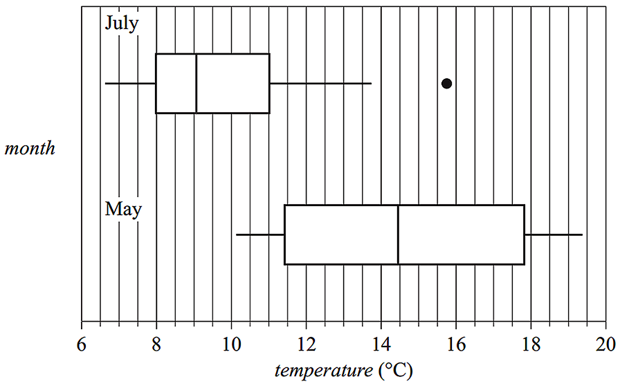
  2. The boxplots below display the distribution of maximum daily temperature for the months of May and July.
     

  3.   i. Describe the shapes of the distributions of daily temperature (including outliers) for July and for May.   (1 mark)

    --- 2 WORK AREA LINES (style=lined) ---

  4.  ii. Determine the value of the upper fence for the July boxplot.   (1 mark)

    --- 3 WORK AREA LINES (style=lined) ---

  5. iii. Using the information from the boxplots, explain why the maximum daily temperature is associated with the month of the year. Quote the values of appropriate statistics in your response.   (1 mark)

    --- 3 WORK AREA LINES (style=lined) ---

Show Answers Only
a.i.   

a.ii.   `text(75%)`

b.i.    `text(July – Positively skewed with an outlier.)`
  `text(May – Symmetrical with no outliers.)`

b.ii.  `15.5^@\text(C)`

b.iii. `text{The median temperature in May (14.5°C)}`

`text(differs from the median temperature in July)`

`text{(just over 9°C). This difference is why the}`

`text(maximum daily temperature is associated)`

`text(with the month.)`

Show Worked Solution
a.i.   

a.ii.   `text(75%)`

MARKER’S COMMENT: Incorrect May descriptors included “evenly or normally distributed”, “bell shaped” and “symmetrically skewed.”
b.i.    `text(July – Positively skewed with an outlier.)`
  `text(May – Symmetrical with no outliers.)`


b.ii.    `text(Upper fence)` `= Q_3 + 1.5 xx IQR`
    `= 11 + 1.5 xx (11 – 8)`
    `= 11 + 4.5`
    `= 15.5^@\text(C)`
♦♦ Mean mark (b)(iii) – 30%.
COMMENT: Refer to the difference in medians. Just quoting the numbers was not enough to gain a mark here.

b.iii. `text{The median temperature in May (14.5°C)}`

`text(differs from the median temperature in July)`

`text{(just over 9°C). This difference is why the}`

`text(maximum daily temperature is associated)`

`text(with the month.)`

Filed Under: Graphs - Stem/Leaf and Boxplots Tagged With: Band 2, Band 3, Band 4, Band 5, smc-643-10-Single Box-Plots, smc-643-20-Parallel Box-Plots, smc-643-30-Draw Box Plots, smc-643-60-Outliers, smc-643-70-Distribution Description

CORE, FUR1 2016 VCAA 8 MC

Parallel boxplots would be an appropriate graphical tool to investigate the association between the monthly median rainfall, in millimetres, and the

  1. monthly median wind speed, in kilometres per hour.
  2. monthly median temperature, in degrees Celsius.
  3. month of the year (January, February, March, etc.).
  4. monthly sunshine time, in hours.
  5. annual rainfall, in millimetres.
Show Answers Only

`C`

Show Worked Solution

`text(Parallel boxplots can be used to investigate an)`

♦ Mean mark 45%.

`text(association between categorical and numerical)`

`text(variables.)`

`text(S)text(ince rainfall is numerical, the other variable must)`

`text(be categorical. Only)\ C\ text(is categorical.)`

`=> C`

Filed Under: Graphs - Stem/Leaf and Boxplots Tagged With: Band 5, smc-643-20-Parallel Box-Plots

CORE, FUR2 2006 VCAA 1

Table 1 shows the heights (in cm) of three groups of randomly chosen boys aged 18 months, 27 months and 36 months respectively.

Core, FUR2 2006 VCAA 11

  1. Complete Table 2 by calculating the standard deviation of the heights of the 18-month-old boys.


    Write your answer correct to one decimal place.   (1 mark)

    --- 2 WORK AREA LINES (style=lined) ---


    Core, FUR2 2006 VCAA 12

A 27-month-old boy has a height of 83.1 cm.

  1. Calculate his standardised height (`z` score) relative to this sample of 27-month-old boys.
  2. Write your answer correct to one decimal place.   (1 mark)

    --- 2 WORK AREA LINES (style=lined) ---

The heights of the 36-month-old boys are normally distributed.

A 36-month-old boy has a standardised height of 2.

  1. Approximately what percentage of 36-month-old boys will be shorter than this child?   (1 mark)

    --- 2 WORK AREA LINES (style=lined) ---

Using the data from Table 1, boxplots have been constructed to display the distributions of heights of 36-month-old and 27-month-old boys as shown below. 

     Core, FUR2 2006 VCAA 13

  1. Complete the display by constructing and drawing a boxplot that shows the distribution of heights for the 18-month-old boys.   (2 marks)

    --- 0 WORK AREA LINES (style=lined) ---

  2. Use the appropriate boxplot to determine the median height (in centimetres) of the 27-month-old boys.   (1 mark)

    --- 1 WORK AREA LINES (style=lined) ---

The three parallel boxplots suggest that height and age (18 months, 27 months, 36 months) are positively related.

  1. Explain why, giving reference to an appropriate statistic.   (1 mark)

    --- 1 WORK AREA LINES (style=lined) ---

Show Answers Only
  1. `3.8`
  2. `−1.4`
  3.  `2.5 text(%)`
  4.  
    Core, FUR2 2006 VCAA 13 Asnwer
  5. `89.5`
  6. `text(Median height increases as age increases.)`
Show Worked Solution

a.   `text(By calculator,)`

`text(standard deviation) = 3.8`


b.    `z` `= (x – barx)/s`
    `= (83.1 – 89.3)/(4.5)`
    `=-1.377…`
    `= -1.4\ \ text{(1 d.p.)}`


♦♦ MARKER’S COMMENT: Attention required here as this standard question was “very poorly answered”.

c.  `text{2.5%  (see graph below)}`

CORE, FUR2 2006 VCAA Answer 111


d.   `text(Range = 76 – 89.8,)\ Q_1 = 80,\ Q_3 = 85.8,\ text(Median = 83,)`

Core, FUR2 2006 VCAA 13 Asnwer

e.   `89.5`

MARKER’S COMMENT: A boxplot statistic was required, so mean values were not relevant.


f.   `text(The median height increases with age.)`

Filed Under: Graphs - Stem/Leaf and Boxplots, Normal Distribution Tagged With: Band 3, Band 4, Band 5, smc-600-10-Single z-score, smc-643-20-Parallel Box-Plots, smc-643-30-Draw Box Plots

CORE, FUR2 2008 VCAA 3

The arm spans (in cm) were also recorded for each of the Years 6, 8 and 10 girls in the larger survey. The results are summarised in the three parallel box plots displayed below.
 

CORE, FUR2 2008 VCAA 3

  1. Complete the following sentence.
  2. The middle 50% of Year 6 students have an arm span between _______ and _______ cm.   (1 mark)

    --- 0 WORK AREA LINES (style=lined) ---

  3. The three parallel box plots suggest that arm span and year level are associated.
  4. Explain why.   (1 mark)

    --- 3 WORK AREA LINES (style=lined) ---

  5. The arm span of 110 cm of a Year 10 girl is shown as an outlier on the box plot. This value is an error. Her real arm span is 140 cm. If the error is corrected, would this girl’s arm span still show as an outlier on the box plot? Give reasons for your answer showing an appropriate calculation.   (2 marks)

    --- 5 WORK AREA LINES (style=lined) ---

Show Answers Only
  1. `text(124 and 148)`
  2. `text(The median arm span increases with the year)`
    `text(level, or the range/IQR decreases as the year.)`
    `text(level increases.)`
  3. `text(See Worked Solution)`
Show Worked Solution

a.   `text(124 and 148 cm)`
 

b.   `text(The median arm span increases with the year)`

♦ Sub 50% mean.
MARKER’S COMMENT: Use specific metrics! Stating “arm span increases” did not receive a mark.

`text(level, or the range/IQR decreases as the year.)`

`text(level increases.)`


c.   `text(Consider the Year 10 boxplot,)`

MARKER’S COMMENT: The final comparison here, “Since 140 < 145” is worth a full mark.

`Q_1=160, \ Q_3=170,`

`=> IQR=170-160=10`

`Q_1-1.5 xx text(IQR)= 160-1.5 xx 10= 145`

`text(S)text(ince 140 < 145,)`

`:. 140\ text(will remain an outlier.)`

Filed Under: Graphs - Stem/Leaf and Boxplots Tagged With: Band 3, Band 4, Band 5, smc-643-20-Parallel Box-Plots, smc-643-60-Outliers

CORE, FUR2 2012 VCAA 3

A weather station records the wind speed and the wind direction each day at 9.00 am. 

The wind speed is recorded, correct to the nearest whole number. 

The parallel boxplots below have been constructed from data that was collected on the 214 days from June to December in 2011.
 

CORE, FUR2 2012 VCAA 3

  1. Complete the following statements.
  2. The wind direction with the lowest recorded wind speed was ________.
  3. The wind direction with the largest range of recorded wind speeds was _______.   (1 mark)

    --- 0 WORK AREA LINES (style=lined) ---

  4. The wind blew from the south on eight days.
  5. Reading from the parallel boxplots above we know that, for these eight wind speeds, the
first quartile `Q_1 = 2\ text(km/h)`
median `M = 3.5\ text(km/h)`
third quartile `Q_3 = 4\ text(km/h)`
  1. Given that the eight wind speeds were recorded to the nearest whole number, write down the eight wind speeds.   (1 mark) 

    --- 4 WORK AREA LINES (style=lined) ---

Show Answers Only
  1. `text(South-East and North East.)`
  2. `2, 2, 2, 3, 4, 4, 4, 4`
Show Worked Solution

a.   `text(South-East and North-East.)`
 

b.   `text(S)text(ince the boxplot has no whiskers and the median is 3.5,)`

`text(the data set is {2, _ , _ , 3, 4, _ , _ , 4})`

♦♦ MARKER’S COMMENT: Although specific data isn’t available, “few” students answered this part correctly.

`text(S)text(ince)\ Q_1=2\ text(and is the mid-point of the 2nd and)`

`text(3rd points, both must be 2.)`

`text(Similarly,)\ Q_3=4,\ text(so the 6th and 7th points are both 4.)`
  

`:.\ text(The data set is:)\ {2, 2, 2, 3, 4, 4, 4, 4}`

Filed Under: Graphs - Stem/Leaf and Boxplots Tagged With: Band 4, Band 5, smc-643-20-Parallel Box-Plots

CORE, FUR2 2015 VCAA 2

The parallel boxplots below compare the distribution of life expectancy for 183 countries for the years 1953, 1973 and 1993.
 

Core, FUR2 2015 VCAA 2

  1. Describe the shape of the distribution of life expectancy for 1973.   (1 mark)

    --- 2 WORK AREA LINES (style=lined) ---

  2. Explain why life expectancy for these countries is associated with the year. Refer to specific statistical values in your answer.   (2 marks)

    --- 5 WORK AREA LINES (style=lined) ---

Show Answers Only
  1. `text(Negatively skewed)`
  2. `text(There is a positive correlation between the median of life)`
    `text(expectancy and the year.)`
Show Worked Solution

a.   `text(Negatively skewed with no outliers. The extended left)`

`text(line from the box clearly indicates negative skew.)`
 

b.   `text(The medians in each boxplot are approximately,)`

♦ Mean mark 45%.
MARKER’S COMMENT: Means are typically not discernible from a box plot (unless the data is perfectly symmetrical) and shouldn’t be referred to.
`1953` `\ \ \ 51`
`1973` `\ \ \ 63`
`1993` `\ \ \ 69`


`:.\ text(The chart shows a positive correlation between the)`

`text(median of life expectancy and the year.)`

Filed Under: Graphs - Stem/Leaf and Boxplots Tagged With: Band 3, Band 5, smc-643-20-Parallel Box-Plots, smc-643-70-Distribution Description

CORE, FUR1 2015 VCAA 6-7 MC

The following information relates to Parts 1 and 2.

In New Zealand, rivers flow into either the Pacific Ocean (the Pacific rivers) or the Tasman Sea (the Tasman rivers).

The boxplots below can be used to compare the distribution of the lengths of the Pacific rivers and the Tasman rivers.
 

CORE, FUR1 2015 VCAA 6 MC

Part 1

The five-number summary for the lengths of the Tasman rivers is closest to

  1. `32, 48, 64, 76, 108`
  2. `32, 48, 64, 76, 180`
  3. `32, 48, 64, 76, 322`
  4. `48, 64, 97, 169, 180`
  5. `48, 64, 97, 169, 322`


Part 2

Which one of the following statements is not true?

  1. The lengths of two of the Tasman rivers are outliers.
  2. The median length of the Pacific rivers is greater than the length of more than 75% of the Tasman rivers.
  3. The Pacific rivers are more variable in length than the Tasman rivers.
  4. More than half of the Pacific rivers are less than 100 km in length.
  5. More than half of the Tasman rivers are greater than 60 km in length.
Show Answers Only

`text(Part 1:)\ B`

`text(Part 2:)\ D`

Show Worked Solution

`text(Part 1)`

♦ Mean mark 46%.

`text(Outliers are inputs into a five-number summary,)`

`text(including the maximum and minimum values.)`

`:.\ text(A maximum length of 180 km is part of the Tasman)`

`text(river summary.)`

`=> B`


`text(Part 2)`

`text(Consider)\ D,`

`D\ text(would be true if its median value was less than)`

`text(100 km, which is not the case.)`

`=> D`

Filed Under: Graphs - Stem/Leaf and Boxplots Tagged With: Band 4, Band 5, smc-643-20-Parallel Box-Plots, smc-643-60-Outliers, smc-643-70-Distribution Description

CORE, FUR1 2007 VCAA 10 MC

The relationship between the variables

size of car (1 = small, 2 = medium, 3 = large)

and

salary level (1 = low, 2 = medium, 3 = high)

is best displayed using 

A.   a scatterplot.

B.   a histogram.

C.   parallel boxplots.

D.   a back-to-back stemplot.

E.   a percentaged segmented bar chart.

Show Answers Only

`E`

Show Worked Solution

`text(A segmented bar chart is required to effectively)`

♦ Mean mark 37%.

`text(display this information given the three)`

`text(sub-categories of each variable.)`

`rArr E`

Filed Under: Graphs - Histograms and Other, Graphs - Stem/Leaf and Boxplots Tagged With: Band 5, smc-643-20-Parallel Box-Plots, smc-643-50-Back-to-Back Stem and Leaf, smc-644-40-Segmented Bar Charts

CORE, FUR1 2007 VCAA 5-6 MC

Samples of jellyfish were selected from two different locations, A and B. The diameter (in mm) of each jellyfish was recorded and the resulting data is summarised in the boxplots shown below.


Part 1

The percentage of jellyfish taken from location A with a diameter greater than 14 mm is closest to

  1. `2text(%)`
  2. `5text(%)`
  3. `25text(%)`
  4. `50text(%)`
  5. `75text(%)`


Part 2

From the boxplots, it can be concluded that the diameters of the jellyfish taken from location A are generally

  1. similar to the diameters of the jellyfish taken from location B.
  2. less than the diameters of the jellyfish taken from location B and less variable.
  3. less than the diameters of the jellyfish taken from location B and more variable.
  4. greater than the diameters of the jellyfish taken from location B and less variable.
  5. greater than the diameters of the jellyfish taken from location B and more variable. 
Show Answers Only

`text (Part 1:)\ C`

`text (Part 2:)\ C`

Show Worked Solution

`text (Part 1)`

`text(Consider the boxplot of location A,)`

`Q_3 = 14`

`:.\ text(25% will have a diameter greater than 14 mm.)`

`rArr C`


`text (Part 2)`

`text(The boxplot of location A has a lower median and a)`

`text(higher range than the boxplot of location B.)`

`rArr C`

Filed Under: Graphs - Stem/Leaf and Boxplots Tagged With: Band 4, smc-643-20-Parallel Box-Plots

CORE, FUR1 2011 VCAA 5 MC

The boxplots below display the distribution of average pay rates, in dollars per hour, earned by workers in 35 countries for the years 1980, 1990 and 2000.
 

Based on the information contained in the boxplots, which one of the following statements is not true?

  1. In 1980, over 50% of the countries had an average pay rate less than $8.00 per hour.
  2. In 1990, over 75% of the countries had an average pay rate greater than $5.00 per hour.
  3. In 1990, the average pay rate in the top 50% of the countries was higher than the average pay rate for any of the countries in 1980.
  4. In 1990, over 50% of the countries had an average pay rate less than the median average pay rate in 2000.
  5. In 2000, over 75% of the countries had an average pay rate greater than the median average pay rate in 1980. 


Show Answers Only

`E`

Show Worked Solution

`text(By elimination,)`

`text(In A, 1980 median is below $8.00. True)`

`text(In B, 1990 Q1 is above $5.00. True)`

`text(In C, 1990 median is above 1980 high. True)`

`text(In D, 1990 median is below 2000 median. True)`

`text(In E, 2000 Q1 is below 1980 median. NOT true)`

`=>  E`

Filed Under: Graphs - Stem/Leaf and Boxplots Tagged With: Band 4, smc-643-20-Parallel Box-Plots

CORE, FUR1 2014 VCAA 7 MC

The parallel boxplots below summarise the distribution of population density, in people per square kilometre, for 27 inner suburbs and 23 outer suburbs of a large city.
 

Which one of the following statements is not true?

  1. More than 50% of the outer suburbs have population densities below 2000 people per square kilometre. 
  2. More than 75% of the inner suburbs have population densities below 6000 people per square kilometre. 
  3. Population densities are more variable in the outer suburbs than in the inner suburbs.
  4. The median population density of the inner suburbs is approximately 4400 people per square kilometre.
  5. Population densities are, on average, higher in the inner suburbs than in the outer suburbs.
Show Answers Only

`C`

Show Worked Solution

`text(The chart of the inner suburbs has both a higher IQR and)`

`text(range than the outer suburbs. This supports the argument)`

`text(that densities are NOT more variable in the outer suburbs,)`

`text(making C an untrue statement.)`


`text(All other statements can be shown to be true using)`

`text(quartile and median comparisons.)`

`=>  C`

Filed Under: Graphs - Stem/Leaf and Boxplots Tagged With: Band 3, smc-643-20-Parallel Box-Plots

Copyright © 2014–2025 SmarterEd.com.au · Log in