SmarterEd

Aussie Maths & Science Teachers: Save your time with SmarterEd

  • Login
  • Get Help
  • About

Statistics, STD1 S1 2024 HSC 24

Students in two classes, Class \(A\) and Class \(B\), recorded the number of text messages they sent in a day. Each class has 18 students.

The results are shown in the dot plots.


Compare the two datasets by examining the skewness, median and spread of the distributions.   (3 marks)

--- 7 WORK AREA LINES (style=lined) ---

Show Answers Only

\begin{array} {|l|c|}
\hline
\rule{0pt}{2.5ex} \text{} \rule[-1ex]{0pt}{0pt} & \text{Range} & \quad Q_1\quad & \text{Median}&\quad Q_3\quad & IQR\\
\hline
\rule{0pt}{2.5ex} \text{Class } A\rule[-1ex]{0pt}{0pt} & 5-1=4&3&4&5&5-3=2\\
\hline
\rule{0pt}{2.5ex} \text{Class } B\rule[-1ex]{0pt}{0pt} & 6-2=4 &2&3&4&4-2=2\\
\hline
\end{array}

\(\text{Skewness:}\)

\(\text{Class A is slightly negatively skewed, while Class B is more symmetrical with}\)

\(\text{a slightly positive skew.}\)
 

\(\text{Median:}\)

\(\text{Class A has a higher median (4) compared to Class B (3).}\)
 

\(\text{Spread:}\)

\(\text{Both classes have the same range (4) and IQR (2), suggesting similar variability}\)

\(\text{in the data.}\)
 

\(\text{In conclusion, while the spread of data is similar for both classes, Class A
tends to}\)

\(\text{have a higher number of text messages sent (higher median and negative skew)}\)

\(\text{compared to Class B, which has a more symmetrical, slightly positive distribution.}\)

Show Worked Solution

\begin{array} {|l|c|}
\hline
\rule{0pt}{2.5ex} \text{} \rule[-1ex]{0pt}{0pt} & \text{Range} & \quad Q_1\quad & \text{Median}&\quad Q_3\quad & IQR\\
\hline
\rule{0pt}{2.5ex} \text{Class } A\rule[-1ex]{0pt}{0pt} & 5-1=4&3&4&5&5-3=2\\
\hline
\rule{0pt}{2.5ex} \text{Class } B\rule[-1ex]{0pt}{0pt} & 6-2=4 &2&3&4&4-2=2\\
\hline
\end{array}

♦♦♦ Mean mark 16%.

\(\text{Skewness:}\)

\(\text{Class A is slightly negatively skewed, while Class B is more symmetrical with}\)

\(\text{a slightly positive skew.}\)
 

\(\text{Median:}\)

\(\text{Class A has a higher median (4) compared to Class B (3).}\)
 

\(\text{Spread:}\)

\(\text{Both classes have the same range (4) and IQR (2), suggesting similar variability}\)

\(\text{in the data.}\)
 

\(\text{In conclusion, while the spread of data is similar for both classes, Class A
tends to}\)

\(\text{have a higher number of text messages sent (higher median and negative skew)}\)

\(\text{compared to Class B, which has a more symmetrical, slightly positive distribution.}\)

Filed Under: Bar Charts, Histograms and Other Graphs (Std 1) Tagged With: Band 6, smc-1128-28-Other Charts

Statistics, STD1 S1 2020 HSC 6 MC

When blood pressure is measured, two numbers are recorded: systolic pressure and diastolic pressure. If the measurements recorded are 140 systolic and 90 diastolic, then the blood pressure is written as 140/90 mmHg.
 
Blood pressure measurements are categorized as shown in the diagram.


Amy has a blood pressure of 97/76 mmHg and Betty has a blood pressure of 125/75 mmHg.

Which row of the table describes the blood pressure for Amy and Betty?
  

Show Answers Only

`D`

Show Worked Solution

`text{Amy: 97/76 is Ideal}`

`text{Betty: 125/75 is Pre-high}`

`=> \ D`

Filed Under: Bar Charts, Histograms and Other Graphs (Std 1) Tagged With: Band 3, smc-1128-28-Other Charts

Statistics, STD2 S1 SM-Bank 2 MC

The dot plots show the height of students in Year 9 and Year 12 in a school. They are drawn on the same scale.


Which statement about the change in heights when comparing Y9 to Y12 is correct?

  1. The mean increased and the standard deviation decreased.
  2. The mean decreased and the standard deviation decreased.
  3. The mean increased and the standard deviation increased.
  4. The mean decreased and the standard deviation increased.
Show Answers Only

`A`

Show Worked Solution

`text{Mean has increased (Y9 to Y12)}`

`text(The Year 12 data is more tightly distributed)`

`text(around the mean.)`

`:.\ text{Standard deviation has decreased (Y9 to Y12)}`

`=> A`

Filed Under: Bar Charts, Histograms and Other Graphs (Std 1), Other Chart Types (Y12), Other Charts (Std 2), Other Charts (Std2-2027), S4 Bivariate Data Analysis (Y12) Tagged With: Band 5, common-content, smc-1128-28-Other Charts, smc-6311-30-Other Charts, smc-822-40-Other Charts, smc-998-40-Other Charts

Statistics, STD2 S1 2018 HSC 17 MC

The area chart shows the number of students involved in tennis or cricket at a school over a number of years.


In which year was the number of students involved in tennis equal to the number of students involved in cricket?

  1. 2013
  2. 2014
  3. 2015
  4. 2016
Show Answers Only

`C`

Show Worked Solution

`text(Area Charts are cumulative,)`

`text(Consider 2015,)`

`text(Cricket players = 30)`

`text(Tennis players) = 60 – 30 = 30`

`=> C`

Filed Under: Bar Charts, Histograms and Other Graphs (Std 1), Other Chart Types (Y12), Other Charts (Std 2) Tagged With: Band 4, common-content, smc-1128-28-Other Charts, smc-822-40-Other Charts, smc-998-40-Other Charts

Statistics, STD2 S1 2017 HSC 26f

The area chart shows the number of goals scored by three hockey teams, `A`, `B` and `C`, in the first 4 rounds.


  1. How many goals were scored by team `C` in round 1?  (1 mark)

    --- 1 WORK AREA LINES (style=lined) ---

  2. In which round did all three teams score the same number of goals?  (1 mark)

    --- 1 WORK AREA LINES (style=lined) ---

Show Answers Only
  1. `4`
  2. `text(Round 3)`
Show Worked Solution
i.   `text(Goals by team C)` `= 9 – 5`
    `= 4`


ii.   `text{In Round 3 (all teams scored 2 goals).}`

Filed Under: Bar Charts, Histograms and Other Graphs (Std 1), Other Chart Types (Y12), Other Charts (Std 2), Other Graphs Tagged With: Band 4, smc-1128-28-Other Charts, smc-822-40-Other Charts, smc-998-40-Other Charts

Statistics, STD2 S1 2015 HSC 19 MC

The table shows the life expectancy (expected remaining years of life) for females at selected ages in the given periods of time.

2015 19 mc

In 1975, a 45‑year‑old female used the information in the table to calculate the age to which she was expected to live. Twenty years later she recalculated the age to which she was expected to live.

What is the difference between the two ages she calculated?

  1.    2.7 years
  2.    3.1 years
  3.    3.7 years
  4.    5.8 years
Show Answers Only

`D`

Show Worked Solution

`text(In 1975, her life expectancy)`

♦ Mean mark 39%.

`=\ text(age + remaining years)`

`= 45 + 34`

`= 79`

`text(In 1995,  her life expectancy)`

`= 65 + 19.8`

`= 84.8`

`:.\ text(Difference)` `= 84.8 − 79`
  `= 5.8\ text(years)`

`⇒ D`

Filed Under: Bar Charts, Histograms and Other Graphs (Std 1), Life Expectancy, Other Chart Types (Y12), Other Charts (Std 2), Other Charts (Std2-2027), S4 Bivariate Data Analysis (Y12) Tagged With: Band 5, common-content, smc-1128-28-Other Charts, smc-6311-30-Other Charts, smc-822-40-Other Charts, smc-998-40-Other Charts

Statistics, STD2 S1 2006 HSC 8 MC

Which of these graphs best represents positively skewed data with the smaller standard deviation?
 

2UG-2006-8abMC

2UG-2006-8cdMC

Show Answers Only

`C`

Show Worked Solution

`text(By elimination)`

`text(Positive skew when the tail on the`

`text(right side is longer.)`

`:.\ text(NOT)\ B\ text(or)\ D`

`text(A smaller standard deviation occurs)`

`text(when data is clustered more closely.)`

`:.\ text(NOT)\ A\ text(where data is more widely spread.)`

`=>  C`

Filed Under: Bar Charts, Histograms and Other Graphs (Std 1), DS5/6 - Normal Distribution and Sampling, Normal Distribution (Y12), Other Chart Types (Y12), Other Charts (Std 2), Other Charts (Std2-2027), Other Graphs, S5 The Normal Distribution (Y12) Tagged With: Band 5, common-content, smc-1128-28-Other Charts, smc-6311-30-Other Charts, smc-819-40-Graphs, smc-822-40-Other Charts, smc-995-40-Graphs, smc-998-40-Other Charts

Statistics, STD2 S1 2004 HSC 8 MC

This sector graph shows the distribution of 116 prizes won by three schools: X, Y and Z.


How many prizes were won by School X?

  1.   26
  2.   32
  3.   81
  4.   99
Show Answers Only

`B`

Show Worked Solution

`text(Centre angle of School X sector)`

`= 100^@\ text{(by measurement)}`
 

`:.\ text(Prizes won by school X)`

`= 100/360 xx 116`

`= 32.22\ …`

`=> B`

Filed Under: Bar Charts, Histograms and Other Graphs (Std 1), Displaying Data, Other Chart Types (Y12), Other Charts (Std 2), Other Charts (Std2-2027), Other Graphs Tagged With: Band 3, common-content, num-title-ct-core, num-title-qs-hsc, smc-1128-28-Other Charts, smc-5076-15-Sector graphs and Divided Bar graphs, smc-6311-30-Other Charts, smc-822-40-Other Charts, smc-998-40-Other Charts

Statistics, STD2 S1 2008 HSC 23e

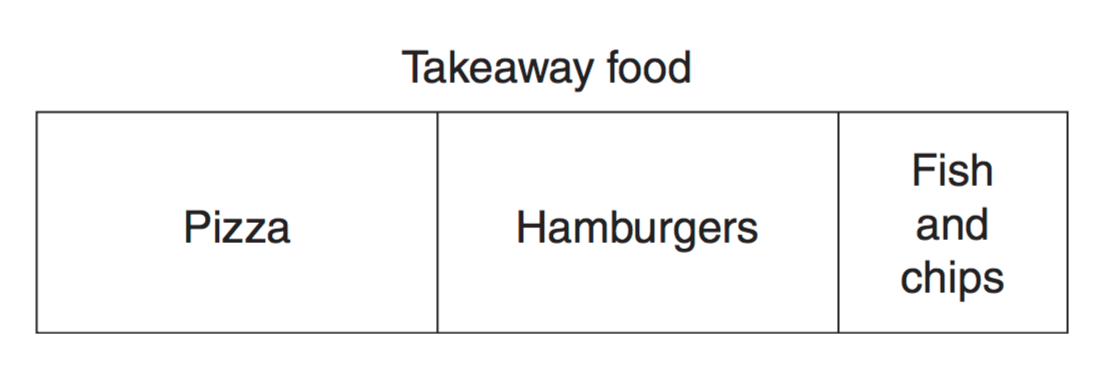
In a survey, 450 people were asked about their favourite takeaway food. The results are displayed in the bar graph.

2008 23e
 
How many people chose pizza as their favourite takeaway food?   (2 marks)

Show Answers Only

`175`

Show Worked Solution

`text(Number of people who chose pizza)`

COMMENT: This question required measurement of the actual image on the exam. The same methodology works here.

`= text{Length of pizza section}/text{Total length of bar} xx 450`

`~~ 7/18 xx 450`

`~~ 175`
 

`:.\ 175\ text(people chose pizza.)`

Filed Under: Bar Charts, Histograms and Other Graphs (Std 1), Displaying Data, Other Chart Types (Y12), Other Charts (Std 2), Other Graphs Tagged With: Band 4, common-content, num-title-ct-core, num-title-qs-hsc, smc-1128-28-Other Charts, smc-5076-15-Sector graphs and Divided Bar graphs, smc-822-40-Other Charts, smc-998-40-Other Charts

Statistics, STD2 S1 2008 HSC 23a

You are organising an outside sporting event at Mathsville and have to decide which month has the best weather for your event. The average temperature must be between 20°C and 30°C, and average rainfall must be less than 80 mm.

The radar chart for Mathsville shows the average temperature for each month, and the table gives the average rainfall for each month.
 

VCAA 2008 23a
 

  1. If you consider only the temperature data, there are a number of possible months for holding the event. Name ONE of these months.  (1 mark)

    --- 1 WORK AREA LINES (style=lined) ---

  2. If both rainfall and temperature data are considered, which month is the best month for the sporting event?   (1 mark)

    --- 1 WORK AREA LINES (style=lined) ---

Show Answers Only
  1. `text(One of Feb, Mar, Nov, Dec)`
  2. `text(November)`
Show Worked Solution

i.  `text(One of Feb, Mar, Nov, Dec)`
 

ii.  `text(November)`

Filed Under: Bar Charts, Histograms and Other Graphs (Std 1), Other Charts (Std 2), Other Charts (Std2-2027), Other Graphs Tagged With: Band 3, smc-1128-28-Other Charts, smc-6311-30-Other Charts, smc-822-40-Other Charts

Statistics, STD2 S1 2014 HSC 1 MC

The step graph shows the cost of telephone calls to China.
 

2014 1 mc

 
Bella made a telephone call at 9.50 pm to a friend in China and spoke to him until 10.07 pm.

How much did this telephone call cost? 

  1.    `$4` 
  2.    `$8`
  3.    `$12`
  4.    `$16`
Show Answers Only

`D`

Show Worked Solution

`=>  D`

Filed Under: Bar Charts, Histograms and Other Graphs (Std 1), FS Communication, Other Charts (Std 2), Other Graphs Tagged With: Band 2, smc-1128-28-Other Charts, smc-822-40-Other Charts

Statistics, STD2 S1 2009 HSC 2 MC

The step graph shows the charges for a carpark. 
 

2UG-2009-2MC

 
Maria enters the carpark at 10:10 am and exits at 1:30 pm.

How much will she pay in charges?

  1.   `$6` 
  2.   `$12` 
  3.   `$18` 
  4.   `$24` 
Show Answers Only

`C`

Show Worked Solution

`text(Time in carpark = 3h 20m)`

`text(From graph, charge will be $18)`

`=>  C`

Filed Under: Bar Charts, Histograms and Other Graphs (Std 1), Other Chart Types (Y12), Other Charts (Std 2), Other Graphs Tagged With: Band 3, common-content, smc-1128-28-Other Charts, smc-822-40-Other Charts, smc-998-40-Other Charts

Statistics, STD2 S1 2012 HSC 7 MC

The Pi Company has two bakeries. The radar chart displays the monthly sales for the bakeries.
 

2012 7 mc 

  
What was the difference in sales in June between the two bakeries?

  1.   $7.50
  2.   $17.50
  3.   $7500
  4.   $17 500
Show Answers Only

`D`

Show Worked Solution
`text(Bakery 1 Sales in June)` `= $17\ 500`
`text(Bakery 2 Sales in June)` `=$35\ 000`
`:.\ text(Difference in Sales)` `= 35\ 000 \-17\ 500`
  `= 17\ 500`

`=>  D`

Filed Under: Bar Charts, Histograms and Other Graphs (Std 1), Other Chart Types (Y12), Other Charts (Std 2), Other Graphs Tagged With: Band 4, common-content, smc-1128-28-Other Charts, smc-822-40-Other Charts, smc-998-40-Other Charts

Statistics, STD2 S1 2010 HSC 1 MC

The results of a survey are displayed in the dot plot.

What is the range of this data?
 

2010 1 MC 
 

  1.    7
  2.    8
  3.    9
  4.    10
Show Answers Only

`C`

Show Worked Solution
`text(Range)` `=text(High)-text(Low)`
  `=9-0`
  `=9`

`=>  C`

Filed Under: Bar Charts, Histograms and Other Graphs (Std 1), Data Analysis, Other Chart Types (Y12), Other Charts (Std 2), Other Charts (Std2-2027), Other Graphs Tagged With: Band 3, common-content, num-title-ct-core, num-title-qs-hsc, smc-1128-28-Other Charts, smc-4224-10-Range, smc-6311-30-Other Charts, smc-822-40-Other Charts, smc-998-40-Other Charts

Copyright © 2014–2025 SmarterEd.com.au · Log in