SmarterEd

Aussie Maths & Science Teachers: Save your time with SmarterEd

  • Login
  • Get Help
  • About

Data Analysis, GEN2 2024 VCAA 2

The boxplot below displays the distribution of all gold medal-winning heights for the women's high jump, \(\textit{Wgold}\), in metres, for the 19 Olympic Games held from 1948 to 2020.

  1. Describe the shape of this data distribution.   (1 mark)

    --- 2 WORK AREA LINES (style=lined) ---

  2. For this boxplot, what is the smallest possible number of \(\textit{Wgold}\) heights lower than 1.85 m?   (1 mark)

    --- 1 WORK AREA LINES (style=lined) ---

  3.  i. Using the boxplot, show that the lower fence is 1.565 m and the upper fence is 2.325 m.  (1 mark)

    --- 3 WORK AREA LINES (style=lined) ---

  4. ii. Referring to the boxplot, the lower fence and the upper fence, explain why no outliers exist.  (1 mark)

    --- 2 WORK AREA LINES (style=lined) ---

Show Answers Only

a.    \(\text{Negatively skewed}\)

b.    \(1\)

c.i.  \(Q_1=1.85,\ Q_3=2.04,\ IQR=2.04-1.85=0.19\)

\(\text{Lower Fence}\) \(=Q_1-1.5\times IQR\)
  \(=1.85-1.5\times 0.19\)
  \(=1.565\)
\(\text{Upper Fence}\) \(=Q_1+1.5\times IQR\)
  \(=2.04+1.5\times 0.19\)
  \(=2.325\)

c.ii. \(\text{No values exist below the lower fence or above the upper fence.}\)

\(\therefore\ \text{No outliers exist.}\)

Show Worked Solution

a.    \(\text{Negatively skewed.}\)
 

b.    \(\text{Only 1 value is needed to extend the whisker below the}\)

\(\text{range of the}\ IQR.\)

♦♦♦ Mean mark (b) 3%.

c.i.  \(Q_1=1.85,\ Q_3=2.04,\ IQR=2.04-1.85=0.19\)

\(\text{Lower Fence}\) \(=Q_1-1.5\times IQR\)
  \(=1.85-1.5\times 0.19\)
  \(=1.565\)
\(\text{Upper Fence}\) \(=Q_1+1.5\times IQR\)
  \(=2.04+1.5\times 0.19\)
  \(=2.325\)


c.ii. \(\text{No values exist below the lower fence or above the upper fence.}\)

\(\therefore\ \text{No outliers exist.}\)

Filed Under: Graphs - Stem/Leaf and Boxplots Tagged With: Band 3, Band 6, smc-643-10-Single Box-Plots, smc-643-60-Outliers, smc-643-70-Distribution Description

Data Analysis, GEN1 2024 VCAA 5 MC

The number of siblings of each member of a class of 24 students was recorded.

The results are displayed in the table below.

\begin{array}{|c|c|c|c|c|c|c|c|c|c|c|c|}
\hline
\rule{0pt}{2.5ex} \ \ 2\ \ \rule[-1ex]{0pt}{0pt} & \ \ 1 \ \ & \ \ 3 \ \ & \ \ 2 \ \ & \ \ 1 \ \ & \ \ 1 \ \ & \ \ 1 \ \ & \ \ 4 \ \ & \ \ 1 \ \ & \ \ 1 \ \ & \ \ 1 \ \ & \ \ 1 \ \ \\
\hline
\rule{0pt}{2.5ex} 1 \rule[-1ex]{0pt}{0pt} & 2 & 1 & 2 & 2 & 1 & 3 & 4 & 2 & 2 & 3 & 1 \\
\hline
\end{array}

A boxplot was constructed to display the spread of the data.

Which one of the following statements about this boxplot is correct?

  1. There are no outliers.
  2. The value of the interquartile range (IQR) is 1.5
  3. The value of the median is 1.5
  4. All of the five-number summary values are whole numbers.
Show Answers Only

\(C\)

Show Worked Solution

\(Q_1=1,\ Q_2=1.5,\ Q_3=2\rightarrow\ \ \text{eliminate D}\)

\(IQR=2-1=1\rightarrow\ \ \text{eliminate B}\)

\(Q_2=1.5 \longrightarrow \text{Median }=1.5 \ \rightarrow\ \text{C correct}\)

\(Q_3+1.5\times IQR=2+1.5\times 1 = 3.5 \ \rightarrow\ \ \text{eliminate A}\)

\(\Rightarrow C\)

Filed Under: Graphs - Stem/Leaf and Boxplots Tagged With: Band 3, smc-468-50-IQR / Outliers, smc-643-10-Single Box-Plots, smc-643-60-Outliers

CORE, FUR1 2021 VCAA 5 MC

 The stem plot below shows the height, in centimetres, of 20 players in a junior football team.
 

A player with a height of 179 cm is considered an outlier because 179 cm is greater than

  1. 162 cm
  2. 169 cm
  3. 172.5 cm
  4. 173 cm
  5. 175.5 cm
Show Answers Only

`E`

Show Worked Solution

`Q_1 = (148 + 148)/2 = 148`

`Q_3 = (158 + 160)/2 = 159`

`IQR = 159 – 148 = 11`

`text{Upper fence}` `= Q_3 + 1.5 xx IQR`
  `= 159 + 1.5 xx 11`
  `= 175.5`

 
`=> E`

Filed Under: Graphs - Stem/Leaf and Boxplots Tagged With: Band 4, smc-643-40-Stem and Leaf, smc-643-60-Outliers

CORE, FUR2 2020 VCAA 3

In a study of the association between BMI and neck size, 250 men were grouped by neck size (below average, average and above average) and their BMI recorded.

Five-number summaries describing the distribution of BMI for each group are displayed in the table below along with the group size.

The associated boxplots are shown below the table.
 

  1. What percentage of these 250 men are classified as having a below average neck size?   (1 mark)

    --- 2 WORK AREA LINES (style=lined) ---

  2. What is the interquartile range (IQR) of BMI for the men with an average neck size?   (1 mark)

    --- 2 WORK AREA LINES (style=lined) ---

  3. People with a BMI of 30 or more are classified as being obese.
  4. Using this criterion, how many of these 250 men would be classified as obese? Assume that the BMI values were all rounded to one decimal place.   (1 mark)

    --- 3 WORK AREA LINES (style=lined) ---

  5. Do the boxplots support the contention that BMI is associated with neck size? Refer to the values of an appropriate statistic in your response.   (2 marks)

    --- 4 WORK AREA LINES (style=lined) ---

Show Answers Only
  1. `20 text(%)`
  2. `2.6`
  3. `23`
  4. `text(See Worked Solutions)`
Show Worked Solution
a.    `text(Percentage)` `= 50/250 xx 100`
    `= 20text(%)`


b.    `text(IQR)` `= 26.0-23.4`
    `= 2.6`


c.   `text{Outliers in average neck size}\ (text(BMI) >= 30) = 4`

♦♦ Mean mark part c. 22%.
COMMENT: Many students incorrectly counted the two “above average” outliers twice.

`:.\ text(Number classified as obese)`

`= 4 + 1/4 xx 76`

`= 23`


d.   `text(The boxplots support a strong association between)`

♦ Mean mark 49%.
MARKER’S COMMENT: General statement of change = 1 mark. Median or IQR values need to be quoted directly for the second mark.

`text(BMI and neck size as median BMI values increase)`

`text(as neck size increases.)`

`text(Below average neck sizes have a BMI of 21.6, which)`

`text(increases to 24.6 for average neck sizes and increases)`

`text(further to 28.1 for above average neck sizes.)`

Filed Under: Graphs - Stem/Leaf and Boxplots Tagged With: Band 2, Band 3, Band 5, smc-643-20-Parallel Box-Plots, smc-643-60-Outliers

Data Analysis, GEN2 2019 NHT 2

The five-number summary below was determined from the sleep time, in hours, of a sample of 59 types of mammals.

\begin{array} {|l|c|}
\hline
\rule{0pt}{2.5ex} \ \ \ \textbf{Statistic} \rule[-1ex]{0pt}{0pt} & \textbf{Sleep time (hours)} \\
\hline
\rule{0pt}{2.5ex} \text{minimum} \rule[-1ex]{0pt}{0pt} & \text{2.5} \\
\hline
\rule{0pt}{2.5ex} \text{first quartile} \rule[-1ex]{0pt}{0pt} & \text{8.0} \\
\hline
\rule{0pt}{2.5ex} \text{median} \rule[-1ex]{0pt}{0pt} & \text{10.5} \\
\hline
\rule{0pt}{2.5ex} \text{third quartile} \rule[-1ex]{0pt}{0pt} & \text{13.5} \\
\hline
\rule{0pt}{2.5ex} \text{maximum} \rule[-1ex]{0pt}{0pt} & \text{20.0} \\
\hline
\end{array}

  1. Show with calculations, that a boxplot constructed from this five-number summary will not include outliers.   (2 marks)

    --- 5 WORK AREA LINES (style=lined) ---

  2. Construct the boxplot below.   (1 mark)

    --- 0 WORK AREA LINES (style=lined) ---


Show Answers Only

  1. `text(Proof (See Worked Solution))`
  2.  

Show Worked Solution

a.    `IQR = Q_3-Q_1 = 13.5-8.0 = 5.5`

`text(Lower fence)` `= Q_1-1.5 xx IQR`
  `= 8-1.5 xx 5.5`
  `= -0.25`


`text(Upper fence)` `= Q_3 + 1.5 xx IQR`
  `= 13.5 + 1.5 xx 5.5`
  `= 21.75`

 
`text(S) text(ince) \ -0.25 < 2.5 \ text{(minimum value) and} \ 21.75 > 20.0 \ text{(maximum value)}`

`=> \ text(no outliers)`
 

b. 

Filed Under: Graphs - Stem/Leaf and Boxplots Tagged With: Band 4, smc-643-30-Draw Box Plots, smc-643-60-Outliers

CORE, FUR2 2019 VCAA 2


The parallel boxplots below show the maximum daily temperature and minimum daily temperature, in degrees Celsius, for 30 days in November 2017.
 

  1. Use the information in the boxplots to complete the following sentences.
  2. For November 2017
  3.    i. the interquartile range for the minimum daily temperature was _____ °C   (1 mark)

    --- 2 WORK AREA LINES (style=lined) ---

  4.  ii. the median value for maximum daily temperature was _____ °C higher than the median value for minimum daily temperature   (1 mark)

    --- 2 WORK AREA LINES (style=lined) ---

  5. iii. the number of days on which the maximum daily temperature was less than the median value for minimum daily temperature was _____    (1 mark)

    --- 2 WORK AREA LINES (style=lined) ---

  1. The temperature difference between the minimum daily temperature and the maximum daily temperature in November 2017 at this location is approximately normally distributed with a mean of 9.4 °C and a standard deviation of 3.2 °C.
  2. Determine the number of days in November 2017 for which this temperature difference is expected to be greater than 9.4 °C.  (1 mark)

    --- 2 WORK AREA LINES (style=lined) ---

Show Answers Only

    1. `5text(°C)`
    2. `10text(°C)`
    3. `1\ text(day)`
  1. `15\ text(days)`

Show Worked Solution

a.i.  `text(IQR)\ = 17-12= 5text(°C)`
 

a.ii.    `text{Median (maximum temperature)}` `= 25`
  `text{Median (minimum temperature)}` `= 15`

 
`:.\ text(Maximum is 10°C higher)`
 

a.iii.  `text{Median (minimum temperature)} = 15text(°C)`

   `text(1 day) => text(maximum temperature is below)\ 15text(°C)`
 

b.    `text(Number of days)` `= 0.50 xx 30`
    `= 15\ text(days)`

Filed Under: Graphs - Stem/Leaf and Boxplots, Normal Distribution Tagged With: Band 2, Band 3, Band 4, smc-600-10-Single z-score, smc-643-20-Parallel Box-Plots, smc-643-60-Outliers

CORE, FUR2 2018 VCAA 1


The data in Table 1 relates to the impact of traffic congestion in 2016 on travel times in 23 cities in the United Kingdom (UK).

The four variables in this data set are:

  • city — name of city
  • congestion level — traffic congestion level (high, medium, low)
  • size — size of city (large, small)
  • increase in travel time — increase in travel time due to traffic congestion (minutes per day).
  1. How many variables in this data set are categorical variables?  (1 mark)

    --- 1 WORK AREA LINES (style=lined) ---

  2. How many variables in this data set are ordinal variables  (1 mark)

    --- 1 WORK AREA LINES (style=lined) ---

  3. Name the large UK cities with a medium level of traffic congestion.  (1 mark)

    --- 1 WORK AREA LINES (style=lined) ---

  4. Use the data in Table 1 to complete the following two-way frequency table, Table 2.  (2 marks)

    --- 0 WORK AREA LINES (style=lined) ---


  5. What percentage of the small cities have a high level of traffic congestion?  (1 mark)

    --- 3 WORK AREA LINES (style=lined) ---

Traffic congestion can lead to an increase in travel times in cities. The dot plot and boxplot below both show the increase in travel time due to traffic congestion, in minutes per day, for the 23 UK cities.


  1. Describe the shape of the distribution of the increase in travel time for the 23 cities.  (1 mark)

    --- 1 WORK AREA LINES (style=lined) ---

  2. The data value 52 is below the upper fence and is not an outlier.
  3. Determine the value of the upper fence.  (1 mark)

    --- 3 WORK AREA LINES (style=lined) ---

Show Answers Only

  1. `3\ text(city, congestion level, size)`
  2. `2\ text(congestion level, size)`
  3. `text(Newcastle-Sunderland and Liverpool)`
  4. `text(See Worked Solutions)`
  5. `25 text(%)`
  6. `text(Positively skewed)`
  7. `52.5`

Show Worked Solution

a.   `3\-text(city, congestion level, size)`
 

b.   `2\-text(congestion level, size)`
 

c.   `text(Newcastle-Sunderland and Liverpool)`
 

d.   


e.    `text(Percentage)` `= text(Number of small cities high congestion)/text(Number of small cities) xx 100`
    `= 4/16 xx 100`
    `= 25 text(%)`

 
f.
   `text(Positively skewed)`


g.   `IQR = 39-30 = 9`
 

`text(Calculate the Upper Fence:)`

`Q_3 + 1.5 xx IQR` `= 39 + 1.5 xx 9`
  `= 52.5`

Filed Under: Graphs - Stem/Leaf and Boxplots, Summary Statistics Tagged With: Band 2, Band 3, Band 4, page-break-before-question, smc-468-10-Data Classification, smc-468-50-IQR / Outliers, smc-643-10-Single Box-Plots, smc-643-60-Outliers, smc-643-70-Distribution Description

CORE, FUR2 2017 VCAA 2

The back-to-back stem plot below displays the wingspan, in millimetres, of 32 moths and their place of capture (forest or grassland).


  1. Which variable, wingspan or place of capture, is a categorical variable?  (1 mark)

    --- 1 WORK AREA LINES (style=lined) ---

  2. Write down the modal wingspan, in millimetres, of the moths captured in the forest.  (1 mark)

    --- 1 WORK AREA LINES (style=lined) ---

  3. Use the information in the back-to-back stem plot to complete the table below.  (2 marks)

    --- 0 WORK AREA LINES (style=lined) ---


  4. Show that the moth captured in the forest that had a wingspan of 52 mm is an outlier.  (2 marks)

    --- 5 WORK AREA LINES (style=lined) ---

  5. The back-to-back stem plot suggests that wingspan is associated with place of capture.
  6. Explain why, quoting the values of an appropriate statistic.  (2 marks)

    --- 4 WORK AREA LINES (style=lined) ---

Show Answers Only

  1. `text(Place of Capture)`
  2. `20\ text(mm)`
  3.    


  4. `text(See Worked Solution)`
  5. `text(See Worked Solution)`

Show Worked Solution

a.   `text(Place of Capture is categorical.)`


b.   `text(Modal wingspan in forest = 20 mm)`


c.   `Q_3\ text(in grassland: 19 data points)`

`:. Q_3\ text{is the 15th data point (lowest to highest) = 36}`


d.    `Q_1\ (text(forest))` `= (text(3rd + 4th))/2 = (20 + 20)/2 = 20`
  `Q_3\ (text(forest))` `= (text(10th + 11th))/2 = (30 + 34)/2 = 32`


`=> IQR = 32 – 20 = 12`

`Q_3 + 1.5 xx IQR` `= 32 + 1.5 xx 12`
  `= 50\ text(mm)`


`:.\ text(S)text(ince 52 mm > 50 mm, 52 min is an outlier.)`


e.   `text(Comparing the median wingspan of both places:)`

`M_text(forest) = 21,\ \ M_text(grassland) = 30`

`text(The higher median of grassland suggests that)`

`text(wingspan is associated with place of capture.)`

Filed Under: Graphs - Stem/Leaf and Boxplots Tagged With: Band 2, Band 3, Band 4, smc-643-50-Back-to-Back Stem and Leaf, smc-643-60-Outliers

CORE, FUR2 2016 VCAA 2

A weather station records daily maximum temperatures.

  1. The five-number summary for the distribution of maximum temperatures for the month of February is displayed in the table below.


  1. There are no outliers in this distribution.
  2.  i. Use the five-number summary above to construct a boxplot on the grid below.   (1 mark)

    --- 0 WORK AREA LINES (style=lined) ---


  1. ii. What percentage of days had a maximum temperature of 21°C, or greater, in this particular February?   (1 mark)

    --- 2 WORK AREA LINES (style=lined) ---

  2. The boxplots below display the distribution of maximum daily temperature for the months of May and July.
     

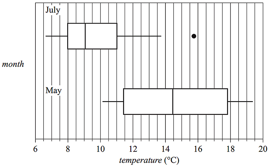
  3.   i. Describe the shapes of the distributions of daily temperature (including outliers) for July and for May.   (1 mark)

    --- 2 WORK AREA LINES (style=lined) ---

  4.  ii. Determine the value of the upper fence for the July boxplot.   (1 mark)

    --- 3 WORK AREA LINES (style=lined) ---

  5. iii. Using the information from the boxplots, explain why the maximum daily temperature is associated with the month of the year. Quote the values of appropriate statistics in your response.   (1 mark)

    --- 3 WORK AREA LINES (style=lined) ---

Show Answers Only
a.i.   

a.ii.   `text(75%)`

b.i.    `text(July – Positively skewed with an outlier.)`
  `text(May – Symmetrical with no outliers.)`

b.ii.  `15.5^@\text(C)`

b.iii. `text{The median temperature in May (14.5°C)}`

`text(differs from the median temperature in July)`

`text{(just over 9°C). This difference is why the}`

`text(maximum daily temperature is associated)`

`text(with the month.)`

Show Worked Solution
a.i.   

a.ii.   `text(75%)`

MARKER’S COMMENT: Incorrect May descriptors included “evenly or normally distributed”, “bell shaped” and “symmetrically skewed.”
b.i.    `text(July – Positively skewed with an outlier.)`
  `text(May – Symmetrical with no outliers.)`


b.ii.    `text(Upper fence)` `= Q_3 + 1.5 xx IQR`
    `= 11 + 1.5 xx (11 – 8)`
    `= 11 + 4.5`
    `= 15.5^@\text(C)`
♦♦ Mean mark (b)(iii) – 30%.
COMMENT: Refer to the difference in medians. Just quoting the numbers was not enough to gain a mark here.

b.iii. `text{The median temperature in May (14.5°C)}`

`text(differs from the median temperature in July)`

`text{(just over 9°C). This difference is why the}`

`text(maximum daily temperature is associated)`

`text(with the month.)`

Filed Under: Graphs - Stem/Leaf and Boxplots Tagged With: Band 2, Band 3, Band 4, Band 5, smc-643-10-Single Box-Plots, smc-643-20-Parallel Box-Plots, smc-643-30-Draw Box Plots, smc-643-60-Outliers, smc-643-70-Distribution Description

CORE, FUR2 2008 VCAA 3

The arm spans (in cm) were also recorded for each of the Years 6, 8 and 10 girls in the larger survey. The results are summarised in the three parallel box plots displayed below.
 

CORE, FUR2 2008 VCAA 3

  1. Complete the following sentence.
  2. The middle 50% of Year 6 students have an arm span between _______ and _______ cm.   (1 mark)

    --- 0 WORK AREA LINES (style=lined) ---

  3. The three parallel box plots suggest that arm span and year level are associated.
  4. Explain why.   (1 mark)

    --- 3 WORK AREA LINES (style=lined) ---

  5. The arm span of 110 cm of a Year 10 girl is shown as an outlier on the box plot. This value is an error. Her real arm span is 140 cm. If the error is corrected, would this girl’s arm span still show as an outlier on the box plot? Give reasons for your answer showing an appropriate calculation.   (2 marks)

    --- 5 WORK AREA LINES (style=lined) ---

Show Answers Only
  1. `text(124 and 148)`
  2. `text(The median arm span increases with the year)`
    `text(level, or the range/IQR decreases as the year.)`
    `text(level increases.)`
  3. `text(See Worked Solution)`
Show Worked Solution

a.   `text(124 and 148 cm)`
 

b.   `text(The median arm span increases with the year)`

♦ Sub 50% mean.
MARKER’S COMMENT: Use specific metrics! Stating “arm span increases” did not receive a mark.

`text(level, or the range/IQR decreases as the year.)`

`text(level increases.)`


c.   `text(Consider the Year 10 boxplot,)`

MARKER’S COMMENT: The final comparison here, “Since 140 < 145” is worth a full mark.

`Q_1=160, \ Q_3=170,`

`=> IQR=170-160=10`

`Q_1-1.5 xx text(IQR)= 160-1.5 xx 10= 145`

`text(S)text(ince 140 < 145,)`

`:. 140\ text(will remain an outlier.)`

Filed Under: Graphs - Stem/Leaf and Boxplots Tagged With: Band 3, Band 4, Band 5, smc-643-20-Parallel Box-Plots, smc-643-60-Outliers

CORE, FUR2 2011 VCAA 1

The stemplot in Figure 1 shows the distribution of the average age, in years, at which women first marry in 17 countries.
 

CORE, FUR2 2011 VCAA 11
 

  1. For these countries, determine
    1. the lowest average age of women at first marriage  (1 mark)

      --- 1 WORK AREA LINES (style=lined) ---

    2. the median average age of women at first marriage  (1 mark)

      --- 1 WORK AREA LINES (style=lined) ---

The stemplot in Figure 2 shows the distribution of the average age, in years, at which men first marry in 17 countries.
 

CORE, FUR2 2011 VCAA 12

  1. For these countries, determine the interquartile range (IQR) for the average age of men at first marriage.  (1 mark)

    --- 3 WORK AREA LINES (style=lined) ---

  2. If the data values displayed in Figure 2 were used to construct a boxplot with outliers, then the country for which the average age of men at first marriage is 26.0 years would be shown as an outlier.
  3. Explain why is this so. Show an appropriate calculation to support your explanation.  (2 marks)

    --- 4 WORK AREA LINES (style=lined) ---

Show Answers Only

    1. `text(25 years)`
    2. `text(28.2 years)`
  1. `text(1.1 years)`
  2. `text(See Worked Solutions)`

Show Worked Solution

a.i.   `text(Lowest age = 25 years)`


a.ii.   `text(Median age of 17 data point is the)`

   `text(9th point = 28.2 years)`


b.   `Q_L = 29.9, Q_U = 31.0,`

`:. IQR` `= Q_U − Q_L`
  `= 31.0 − 29.9`
  `= 1.1\ text(years)`


c.   `1.5 xx IQR = 1.5 xx 1.1 = 1.65`

MARKER’S COMMENT: Many students correctly calculated 28.25 but then failed to discuss how 26.0 related to it.

`Q_1 – IQR` `=29.9-1.65`
  `=28.25`


`text(S)text(ince  26.0 < 28.25,)`

`:. 26.0\ text(is an outlier.)`

Filed Under: Graphs - Stem/Leaf and Boxplots Tagged With: Band 3, Band 4, smc-643-40-Stem and Leaf, smc-643-60-Outliers

CORE, FUR1 2015 VCAA 6-7 MC

The following information relates to Parts 1 and 2.

In New Zealand, rivers flow into either the Pacific Ocean (the Pacific rivers) or the Tasman Sea (the Tasman rivers).

The boxplots below can be used to compare the distribution of the lengths of the Pacific rivers and the Tasman rivers.
 

CORE, FUR1 2015 VCAA 6 MC

Part 1

The five-number summary for the lengths of the Tasman rivers is closest to

  1. `32, 48, 64, 76, 108`
  2. `32, 48, 64, 76, 180`
  3. `32, 48, 64, 76, 322`
  4. `48, 64, 97, 169, 180`
  5. `48, 64, 97, 169, 322`


Part 2

Which one of the following statements is not true?

  1. The lengths of two of the Tasman rivers are outliers.
  2. The median length of the Pacific rivers is greater than the length of more than 75% of the Tasman rivers.
  3. The Pacific rivers are more variable in length than the Tasman rivers.
  4. More than half of the Pacific rivers are less than 100 km in length.
  5. More than half of the Tasman rivers are greater than 60 km in length.
Show Answers Only

`text(Part 1:)\ B`

`text(Part 2:)\ D`

Show Worked Solution

`text(Part 1)`

♦ Mean mark 46%.

`text(Outliers are inputs into a five-number summary,)`

`text(including the maximum and minimum values.)`

`:.\ text(A maximum length of 180 km is part of the Tasman)`

`text(river summary.)`

`=> B`


`text(Part 2)`

`text(Consider)\ D,`

`D\ text(would be true if its median value was less than)`

`text(100 km, which is not the case.)`

`=> D`

Filed Under: Graphs - Stem/Leaf and Boxplots Tagged With: Band 4, Band 5, smc-643-20-Parallel Box-Plots, smc-643-60-Outliers, smc-643-70-Distribution Description

CORE, FUR1 2014 VCAA 6 MC

The dot plot below shows the distribution of the time, in minutes, that 50 people spent waiting to get help from a call centre.


Which one of the following boxplots best represents the data?

Show Answers Only

`A`

Show Worked Solution

`text(There are 50 data points.)`

♦ Mean mark 37%.
MARKER’S COMMENT: A majority of students failed to calculate the outer fence where outliers begin, a step required to get the correct answer.

`Q_1 = 30,\ \ Q_3 = 50\ \ \text{(from dot plot)}`

`text(IQR)\ = 50-30 = 20`


`∴\ text(Outliers occur above)`

`Q3 + 1.5 xx IQR` `=50 + (1.5 xx 20)`
  `=80\ text(minutes)`
`text(S)text(ince the dot plot has only 2 values above 80,)`

`=>  A`

Filed Under: Graphs - Stem/Leaf and Boxplots Tagged With: Band 5, page-break-before-question, smc-643-10-Single Box-Plots, smc-643-60-Outliers

Copyright © 2014–2025 SmarterEd.com.au · Log in