SmarterEd

Aussie Maths & Science Teachers: Save your time with SmarterEd

  • Login
  • Get Help
  • About

Data Analysis, GEN2 2024 VCAA 2

The boxplot below displays the distribution of all gold medal-winning heights for the women's high jump, \(\textit{Wgold}\), in metres, for the 19 Olympic Games held from 1948 to 2020.

  1. Describe the shape of this data distribution.   (1 mark)

    --- 2 WORK AREA LINES (style=lined) ---

  2. For this boxplot, what is the smallest possible number of \(\textit{Wgold}\) heights lower than 1.85 m?   (1 mark)

    --- 1 WORK AREA LINES (style=lined) ---

  3.  i. Using the boxplot, show that the lower fence is 1.565 m and the upper fence is 2.325 m.  (1 mark)

    --- 3 WORK AREA LINES (style=lined) ---

  4. ii. Referring to the boxplot, the lower fence and the upper fence, explain why no outliers exist.  (1 mark)

    --- 2 WORK AREA LINES (style=lined) ---

Show Answers Only

a.    \(\text{Negatively skewed}\)

b.    \(1\)

c.i.  \(Q_1=1.85,\ Q_3=2.04,\ IQR=2.04-1.85=0.19\)

\(\text{Lower Fence}\) \(=Q_1-1.5\times IQR\)
  \(=1.85-1.5\times 0.19\)
  \(=1.565\)
\(\text{Upper Fence}\) \(=Q_1+1.5\times IQR\)
  \(=2.04+1.5\times 0.19\)
  \(=2.325\)

c.ii. \(\text{No values exist below the lower fence or above the upper fence.}\)

\(\therefore\ \text{No outliers exist.}\)

Show Worked Solution

a.    \(\text{Negatively skewed.}\)
 

b.    \(\text{Only 1 value is needed to extend the whisker below the}\)

\(\text{range of the}\ IQR.\)

♦♦♦ Mean mark (b) 3%.

c.i.  \(Q_1=1.85,\ Q_3=2.04,\ IQR=2.04-1.85=0.19\)

\(\text{Lower Fence}\) \(=Q_1-1.5\times IQR\)
  \(=1.85-1.5\times 0.19\)
  \(=1.565\)
\(\text{Upper Fence}\) \(=Q_1+1.5\times IQR\)
  \(=2.04+1.5\times 0.19\)
  \(=2.325\)


c.ii. \(\text{No values exist below the lower fence or above the upper fence.}\)

\(\therefore\ \text{No outliers exist.}\)

Filed Under: Graphs - Stem/Leaf and Boxplots Tagged With: Band 3, Band 6, smc-643-10-Single Box-Plots, smc-643-60-Outliers, smc-643-70-Distribution Description

Data Analysis, GEN1 2019 NHT 1-2 MC

The histogram and boxplot shown below both display the distribution of the birth weight, in grams, of 200 babies.
 

Part 1

The shape of the distribution of the babies’ birth weight is best described as

  1. positively skewed with no outliers.
  2. negatively skewed with no outliers.
  3. approximately symmetric with no outliers.
  4. positively skewed with outliers.
  5. approximately symmetric with outliers.


Part 2

The number of babies with a birth weight between 3000 g and 3500 g is closest to

  1. 30
  2. 32
  3. 37
  4. 74
  5. 80
Show Answers Only
  1. `text(Part 1:)\ E`
  2. `text(Part 2:)\ D`
Show Worked Solution

`text(Part 1)`

`text(Approximately symmetric with outliers.)`

`=>\ E`


`text(Part 2)`

`text(Column representing 3000 – 3500g) ~~  37text(%)`

`text(37%) xx 200 = 74\ text(babies)`

`=> D`

Filed Under: Graphs - Stem/Leaf and Boxplots Tagged With: Band 3, smc-643-10-Single Box-Plots, smc-643-70-Distribution Description

CORE, FUR2 2019 VCAA 3

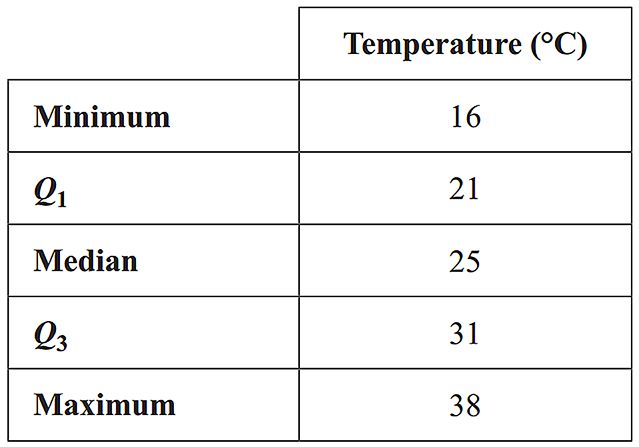
The five-number summary for the distribution of minimum daily temperature for the months of February, May and July in 2017 is shown in Table 2.

The associated boxplots are shown below the table.

Explain why the information given above supports the contention that minimum daily temperature is associated with the month. Refer to the values of an appropriate statistic in your response.  (2 marks)

Show Answers Only

`text(See Worked Solutions)`

Show Worked Solution

`text(The appropriate statistic to explore a possible association)`

`text(is the median.)`

`text(The median of the minimum daily temperature exhibits a clear)`

`text(down trend as the months of the year increase. This supports the)`

`text(contention of an association between the variables.)`

Filed Under: Graphs - Stem/Leaf and Boxplots Tagged With: Band 4, smc-643-20-Parallel Box-Plots, smc-643-70-Distribution Description

CORE, FUR2 2018 VCAA 1


The data in Table 1 relates to the impact of traffic congestion in 2016 on travel times in 23 cities in the United Kingdom (UK).

The four variables in this data set are:

  • city — name of city
  • congestion level — traffic congestion level (high, medium, low)
  • size — size of city (large, small)
  • increase in travel time — increase in travel time due to traffic congestion (minutes per day).
  1. How many variables in this data set are categorical variables?  (1 mark)

    --- 1 WORK AREA LINES (style=lined) ---

  2. How many variables in this data set are ordinal variables  (1 mark)

    --- 1 WORK AREA LINES (style=lined) ---

  3. Name the large UK cities with a medium level of traffic congestion.  (1 mark)

    --- 1 WORK AREA LINES (style=lined) ---

  4. Use the data in Table 1 to complete the following two-way frequency table, Table 2.  (2 marks)

    --- 0 WORK AREA LINES (style=lined) ---


  5. What percentage of the small cities have a high level of traffic congestion?  (1 mark)

    --- 3 WORK AREA LINES (style=lined) ---

Traffic congestion can lead to an increase in travel times in cities. The dot plot and boxplot below both show the increase in travel time due to traffic congestion, in minutes per day, for the 23 UK cities.


  1. Describe the shape of the distribution of the increase in travel time for the 23 cities.  (1 mark)

    --- 1 WORK AREA LINES (style=lined) ---

  2. The data value 52 is below the upper fence and is not an outlier.
  3. Determine the value of the upper fence.  (1 mark)

    --- 3 WORK AREA LINES (style=lined) ---

Show Answers Only

  1. `3\ text(city, congestion level, size)`
  2. `2\ text(congestion level, size)`
  3. `text(Newcastle-Sunderland and Liverpool)`
  4. `text(See Worked Solutions)`
  5. `25 text(%)`
  6. `text(Positively skewed)`
  7. `52.5`

Show Worked Solution

a.   `3\-text(city, congestion level, size)`
 

b.   `2\-text(congestion level, size)`
 

c.   `text(Newcastle-Sunderland and Liverpool)`
 

d.   


e.    `text(Percentage)` `= text(Number of small cities high congestion)/text(Number of small cities) xx 100`
    `= 4/16 xx 100`
    `= 25 text(%)`

 
f.
   `text(Positively skewed)`


g.   `IQR = 39-30 = 9`
 

`text(Calculate the Upper Fence:)`

`Q_3 + 1.5 xx IQR` `= 39 + 1.5 xx 9`
  `= 52.5`

Filed Under: Graphs - Stem/Leaf and Boxplots, Summary Statistics Tagged With: Band 2, Band 3, Band 4, page-break-before-question, smc-468-10-Data Classification, smc-468-50-IQR / Outliers, smc-643-10-Single Box-Plots, smc-643-60-Outliers, smc-643-70-Distribution Description

CORE, FUR1 2018 VCAA 6 MC

Data was collected to investigate the association between the following two variables:

    • age (29 and under, 30–59, 60 and over)
    • uses public transport (yes, no)

Which one of the following is appropriate to use in the statistical analysis of this association?

  1. a scatterplot
  2. parallel box plots
  3. a least squares line
  4. a segmented bar chart
  5. the correlation coefficient r
Show Answers Only

`=> D`

Show Worked Solution

`text(A segmented bar chart is the best way to display the association)`

`text(between these two categorical variables.)`

`=> D`

Filed Under: Graphs - Histograms and Other, Graphs - Stem/Leaf and Boxplots Tagged With: Band 4, smc-643-70-Distribution Description, smc-644-40-Segmented Bar Charts

CORE, FUR2 2016 VCAA 2

A weather station records daily maximum temperatures.

  1. The five-number summary for the distribution of maximum temperatures for the month of February is displayed in the table below.


  1. There are no outliers in this distribution.
  2.  i. Use the five-number summary above to construct a boxplot on the grid below.   (1 mark)

    --- 0 WORK AREA LINES (style=lined) ---


  1. ii. What percentage of days had a maximum temperature of 21°C, or greater, in this particular February?   (1 mark)

    --- 2 WORK AREA LINES (style=lined) ---

  2. The boxplots below display the distribution of maximum daily temperature for the months of May and July.
     

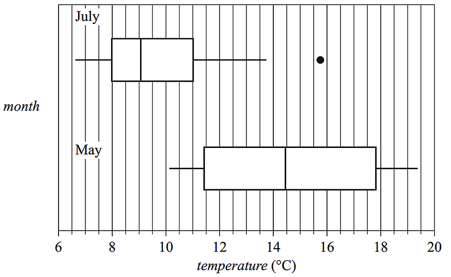
  3.   i. Describe the shapes of the distributions of daily temperature (including outliers) for July and for May.   (1 mark)

    --- 2 WORK AREA LINES (style=lined) ---

  4.  ii. Determine the value of the upper fence for the July boxplot.   (1 mark)

    --- 3 WORK AREA LINES (style=lined) ---

  5. iii. Using the information from the boxplots, explain why the maximum daily temperature is associated with the month of the year. Quote the values of appropriate statistics in your response.   (1 mark)

    --- 3 WORK AREA LINES (style=lined) ---

Show Answers Only
a.i.   

a.ii.   `text(75%)`

b.i.    `text(July – Positively skewed with an outlier.)`
  `text(May – Symmetrical with no outliers.)`

b.ii.  `15.5^@\text(C)`

b.iii. `text{The median temperature in May (14.5°C)}`

`text(differs from the median temperature in July)`

`text{(just over 9°C). This difference is why the}`

`text(maximum daily temperature is associated)`

`text(with the month.)`

Show Worked Solution
a.i.   

a.ii.   `text(75%)`

MARKER’S COMMENT: Incorrect May descriptors included “evenly or normally distributed”, “bell shaped” and “symmetrically skewed.”
b.i.    `text(July – Positively skewed with an outlier.)`
  `text(May – Symmetrical with no outliers.)`


b.ii.    `text(Upper fence)` `= Q_3 + 1.5 xx IQR`
    `= 11 + 1.5 xx (11 – 8)`
    `= 11 + 4.5`
    `= 15.5^@\text(C)`
♦♦ Mean mark (b)(iii) – 30%.
COMMENT: Refer to the difference in medians. Just quoting the numbers was not enough to gain a mark here.

b.iii. `text{The median temperature in May (14.5°C)}`

`text(differs from the median temperature in July)`

`text{(just over 9°C). This difference is why the}`

`text(maximum daily temperature is associated)`

`text(with the month.)`

Filed Under: Graphs - Stem/Leaf and Boxplots Tagged With: Band 2, Band 3, Band 4, Band 5, smc-643-10-Single Box-Plots, smc-643-20-Parallel Box-Plots, smc-643-30-Draw Box Plots, smc-643-60-Outliers, smc-643-70-Distribution Description

CORE, FUR2 2010 VCAA 1

Table 1 shows the percentage of women ministers in the parliaments of 22 countries in 2008.
 

CORE, FUR2 2010 VCAA 11
 

  1. What proportion of these 22 countries have a higher percentage of women ministers in their parliament than Australia?  (1 mark)

    --- 1 WORK AREA LINES (style=lined) ---

  2. Determine the median, range and interquartile range of this data.  (2 marks)

    --- 5 WORK AREA LINES (style=lined) ---

The ordered stemplot below displays the distribution of the percentage of women ministers in parliament for 21 of these countries. The value of Canada is missing.
 

    CORE, FUR2 2010 VCAA 12
 

  1. Complete the stemplot above by adding the value for Canada.  (1 mark)

    --- 1 WORK AREA LINES (style=lined) ---

  2. Both the median and the mean appropriate measures of centre for this distribution.
  3. Explain why.  (1 mark)

    --- 1 WORK AREA LINES (style=lined) ---

Show Answers Only

  1. `0.5`
  2. `text(Median= 28, Range = 56, IQR = 17)`
  3. `1 | 246`
  4. `text(S)text(ince the distribution is approximately)`


    `text(symmetric, the median and mean will be)`


    `text(appropriate measures of the centre.)`

Show Worked Solution

a.   `11/22 = 0.5`

b.   `text(22 data points,)`

`text(Median)` `=\ text{(11th + 12th)}/2`
  `= (32 + 24)/2`
  `= 28`


`text(Range)` `= 56 – 0`
  `= 56`

 
`Q_1=21 and Q_3=38`

`text(IQR)` `= 38 – 21`
  `= 17`


c.   `1 | 2 quad 4 quad 6`

♦♦ Part (d) was “poorly answered”.
MARKER’S COMMENT: The use of “symmetric” gained a mark while “evenly distributed” was deemed too vague.


d.   `text(S)text(ince the distribution is approximately)`

`text(symmetric, the median and mean will be)`

`text(appropriate measures of the centre.)`

Filed Under: Graphs - Stem/Leaf and Boxplots Tagged With: Band 2, Band 3, Band 4, smc-643-40-Stem and Leaf, smc-643-70-Distribution Description

CORE, FUR2 2015 VCAA 2

The parallel boxplots below compare the distribution of life expectancy for 183 countries for the years 1953, 1973 and 1993.
 

Core, FUR2 2015 VCAA 2

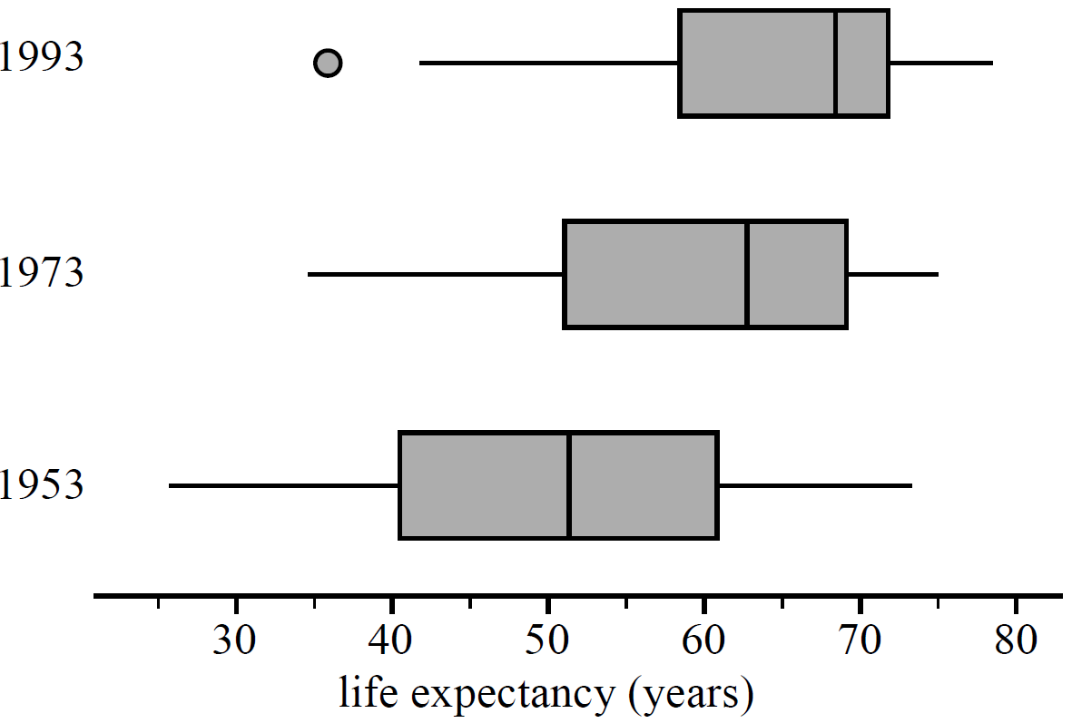
  1. Describe the shape of the distribution of life expectancy for 1973.   (1 mark)

    --- 2 WORK AREA LINES (style=lined) ---

  2. Explain why life expectancy for these countries is associated with the year. Refer to specific statistical values in your answer.   (2 marks)

    --- 5 WORK AREA LINES (style=lined) ---

Show Answers Only
  1. `text(Negatively skewed)`
  2. `text(There is a positive correlation between the median of life)`
    `text(expectancy and the year.)`
Show Worked Solution

a.   `text(Negatively skewed with no outliers. The extended left)`

`text(line from the box clearly indicates negative skew.)`
 

b.   `text(The medians in each boxplot are approximately,)`

♦ Mean mark 45%.
MARKER’S COMMENT: Means are typically not discernible from a box plot (unless the data is perfectly symmetrical) and shouldn’t be referred to.
`1953` `\ \ \ 51`
`1973` `\ \ \ 63`
`1993` `\ \ \ 69`


`:.\ text(The chart shows a positive correlation between the)`

`text(median of life expectancy and the year.)`

Filed Under: Graphs - Stem/Leaf and Boxplots Tagged With: Band 3, Band 5, smc-643-20-Parallel Box-Plots, smc-643-70-Distribution Description

CORE, FUR1 2015 VCAA 6-7 MC

The following information relates to Parts 1 and 2.

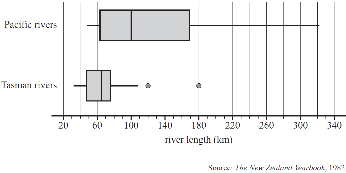
In New Zealand, rivers flow into either the Pacific Ocean (the Pacific rivers) or the Tasman Sea (the Tasman rivers).

The boxplots below can be used to compare the distribution of the lengths of the Pacific rivers and the Tasman rivers.
 

CORE, FUR1 2015 VCAA 6 MC

Part 1

The five-number summary for the lengths of the Tasman rivers is closest to

  1. `32, 48, 64, 76, 108`
  2. `32, 48, 64, 76, 180`
  3. `32, 48, 64, 76, 322`
  4. `48, 64, 97, 169, 180`
  5. `48, 64, 97, 169, 322`


Part 2

Which one of the following statements is not true?

  1. The lengths of two of the Tasman rivers are outliers.
  2. The median length of the Pacific rivers is greater than the length of more than 75% of the Tasman rivers.
  3. The Pacific rivers are more variable in length than the Tasman rivers.
  4. More than half of the Pacific rivers are less than 100 km in length.
  5. More than half of the Tasman rivers are greater than 60 km in length.
Show Answers Only

`text(Part 1:)\ B`

`text(Part 2:)\ D`

Show Worked Solution

`text(Part 1)`

♦ Mean mark 46%.

`text(Outliers are inputs into a five-number summary,)`

`text(including the maximum and minimum values.)`

`:.\ text(A maximum length of 180 km is part of the Tasman)`

`text(river summary.)`

`=> B`


`text(Part 2)`

`text(Consider)\ D,`

`D\ text(would be true if its median value was less than)`

`text(100 km, which is not the case.)`

`=> D`

Filed Under: Graphs - Stem/Leaf and Boxplots Tagged With: Band 4, Band 5, smc-643-20-Parallel Box-Plots, smc-643-60-Outliers, smc-643-70-Distribution Description

CORE, FUR1 2015 VCAA 1 MC

The stem plot below displays the average number of decayed teeth in 12-year-old children from `31` countries.
 

     CORE, FUR1 2015 VCAA 1 MC
 

Based on this stem plot, the distribution of the average number of decayed teeth for these countries is best described as

  1. negatively skewed with a median of 15 decayed teeth and a range of 45
  2. positively skewed with a median of 15 decayed teeth and a range of 45
  3. approximately symmetric with a median of 1.5 decayed teeth and a range of 4.5
  4. negatively skewed with a median of 1.5 decayed teeth and a range of 4.5
  5. positively skewed with a median of 1.5 decayed teeth and a range of 4.5
Show Answers Only

`E`

Show Worked Solution

`text(Median = 16th value)\ = 1.5`

`text(Range)\ = 4.7-0.2=4.5`

`text(The clear tail to the upper end of values shows that the)`

`text(data is positively skewed.)`

`=> E`

Filed Under: Graphs - Stem/Leaf and Boxplots Tagged With: Band 4, smc-643-40-Stem and Leaf, smc-643-70-Distribution Description

CORE, FUR1 2006 VCAA 1-3 MC

The back-to-back ordered stemplot below shows the distribution of maximum temperatures (in °Celsius) of two towns, Beachside and Flattown, over 21 days in January.


Part 1

The variables

temperature (°Celsius), and

town (Beachside or Flattown), are

A.   both categorical variables.

B.   both numerical variables.

C.   categorical and numerical variables respectively.

D.   numerical and categorical variables respectively.

E.   neither categorical nor numerical variables.


Part 2

For Beachside, the range of maximum temperatures is

A.     `3°text(C)`

B.   `23°text(C)`

C.   `32°text(C)`

D.   `33°text(C)`

E.   `38°text(C)`


Part 3

The distribution of maximum temperatures for Flattown is best described as

A.   negatively skewed.

B.   positively skewed.

C.   positively skewed with outliers.

D.   approximately symmetric.

E.   approximately symmetric with outliers.

Show Answers Only

`text (Part 1:)\ D`

`text (Part 2:)\ B`

`text (Part 3:)\ E`

Show Worked Solution

`text (Part 1)`

`text(Temperature is numerical,)`

`text(Town is categorical.)`

`rArr D`


`text (Part 2)`

`text(Beachside’s maximum temperature range)`

`=38-15`

`=23°text(C)`

`rArr B`


`text (Part 3)`

`IQR\ text{(Beachside)}`  `=Q_3 – Q_1`
  `=40-33`
  `=7`
`Q_1 – 1.5 xx IQR` `=33 – 1.5 xx7`
  `=22.5°text(C)`

 
`:.\ text(Flattown’s maximum temperature readings of)`

`text(18° and 19° are outliers.)`

`rArr E`

Filed Under: Graphs - Stem/Leaf and Boxplots Tagged With: Band 3, Band 4, smc-643-50-Back-to-Back Stem and Leaf, smc-643-70-Distribution Description

CORE, FUR1 2008 VCAA 1-4 MC

The box plot below shows the distribution of the time, in seconds, that 79 customers spent moving along a particular aisle in a large supermarket.
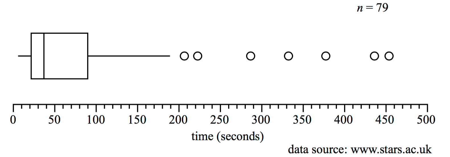
 

     2008 1-4

Part 1

The longest time, in seconds, spent moving along this aisle is closest to

A.    `40`

B.    `60`

C.   `190`

D.   `450`

E.   `500`


Part 2

The shape of the distribution is best described as

A.   symmetric.

B.   negatively skewed.

C.   negatively skewed with outliers.

D.   positively skewed.

E.   positively skewed with outliers.


Part 3

The number of customers who spent more than 90 seconds moving along this aisle is closest to

A.    `7`

B.   `20`

C.   `26`

D.   `75`

E.   `79`


Part 4

From the box plot, it can be concluded that the median time spent moving along the supermarket aisle is

A.   less than the mean time.

B.   equal to the mean time.

C.   greater than the mean time

D.   half of the interquartile range.

E.   one quarter of the range.

Show Answers Only

`text(Part 1:)\ D`

`text(Part 2:)\ E`

`text(Part 3:)\ B`

`text(Part 4:)\ A`

Show Worked Solution

`text(Part 1)`

`text(Longest time is represented by the farthest right)`

`text(data point.)`

`=>D`


`text(Part 2)`

`text(Positively skewed as the tail of the distribution can)`

`text(clearly be seen to extend to the right.)`

`text(The data also clearly shows outliers.)`

`=>E`


`text(Part 3)`

♦ Mean mark 43%.
MARKERS’ COMMENT: Note that the outliers are already accounted for in the boxplot.

`text(From the box plot,)`

`text(Q)_3=90\ text{s}\ \ text{(i.e. 25% spend over 90 s)}`

`:.\ text(Customers that spend over 90 s)`

`= 25text(%) xx 79`

`=19.75`

`=>B`


`text(Part 4)`

`text(The mean is greater than the median for positively)`

`text(skewed data.)`

`=>A`

Filed Under: Graphs - Stem/Leaf and Boxplots Tagged With: Band 3, Band 4, Band 5, smc-643-10-Single Box-Plots, smc-643-70-Distribution Description

CORE, FUR1 2009 VCAA 1-3 MC

The back-to-back ordered stem plot below shows the female and male smoking rates, expressed as a percentage, in 18 countries.


Part 1

For these 18 countries, the lowest female smoking rate is

A.     `5text(%)`  

B.     `7text(%)`  

C.     `9text(%)`  

D.   `15text(%)`  

E.   `19text(%)`  


Part 2

For these 18 countries, the interquartile range (IQR) of the female smoking rates is

A.     `4` 

B.     `6`

C.   `19`

D.   `22`

E.   `23`


Part 3

For these 18 countries, the smoking rates for females are generally

A.   lower and less variable than the smoking rates for males.

B.   lower and more variable than the smoking rates for males.

C.   higher and less variable than the smoking rates for males.

D.   higher and more variable than the smoking rates for males.

E.   about the same as the smoking rates for males.

Show Answers Only

`text(Part  1:) \ D`

`text(Part  2:) \ B`

`text(Part  3:) \ A`

Show Worked Solution

`text(Part  1)`

`text(Lowest female smoking rate is 15%.)`

`=>  D`


`text(Part  2)`

`text(18 data points.)`

`text(Split in half and take the middle point of each group.)`

`Q_L` `=5 text(th value = 19%)`
`Q_U` `= 14 text(th value = 25%)`
 `∴ IQR` `= 25text(% – 19%) =6text(%)` 

 
`=>  B`


`text(Part  3)`

`text{Smoking rates are lower and less variable (range of}`

`text{females rates vs male rates is 13% vs 30%).}`

`=>  A`

Filed Under: Graphs - Stem/Leaf and Boxplots Tagged With: Band 2, Band 3, smc-643-50-Back-to-Back Stem and Leaf, smc-643-70-Distribution Description

Copyright © 2014–2025 SmarterEd.com.au · Log in