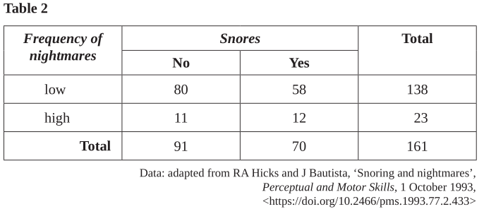
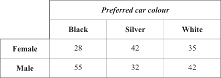
The data in the table below shows the preferred car colour for a sample of female and male car buyers.
Part 1
From this table, the percentage of female car buyers whose preferred car colour is silver is closest to
- 33%
- 40%
- 42%
- 57%
Part 2
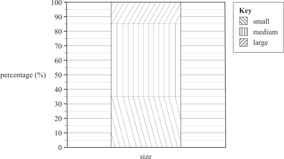
Which one of the following is the most appropriate way to graphically display the data shown in the table above?
- a histogram
- a back-to-back stem plot
- parallel boxplots
- a segmented bar chart