Which graph represents a negatively skewed distribution?


Aussie Maths & Science Teachers: Save your time with SmarterEd
Which graph represents a negatively skewed distribution?
The dot plots show the height of students in Year 9 and Year 12 in a school. They are drawn on the same scale.

Which statement about the change in heights when comparing Y9 to Y12 is correct?
The area chart shows the number of students involved in tennis or cricket at a school over a number of years.

In which year was the number of students involved in tennis equal to the number of students involved in cricket?
A set of data is displayed in this dot plot.

Which of the following best describes this set of data?
The area chart shows the number of goals scored by three hockey teams, `A`, `B` and `C`, in the first 4 rounds.

--- 1 WORK AREA LINES (style=lined) ---
--- 1 WORK AREA LINES (style=lined) ---
The table shows the life expectancy (expected remaining years of life) for females at selected ages in the given periods of time.

In 1975, a 45‑year‑old female used the information in the table to calculate the age to which she was expected to live. Twenty years later she recalculated the age to which she was expected to live.
What is the difference between the two ages she calculated?
The sector graph shows the proportion of people, as a percentage, living in each region of Sumcity. There are 24 000 people living in the Eastern Suburbs.

--- 1 WORK AREA LINES (style=lined) ---
Jake used the information above to draw a column graph.

Identify this region and justify your answer. (2 marks)
--- 4 WORK AREA LINES (style=lined) ---
Which of these graphs best represents positively skewed data with the smaller standard deviation?


This sector graph shows the distribution of 116 prizes won by three schools: X, Y and Z.

How many prizes were won by School X?
In a survey, 450 people were asked about their favourite takeaway food. The results are displayed in the bar graph.
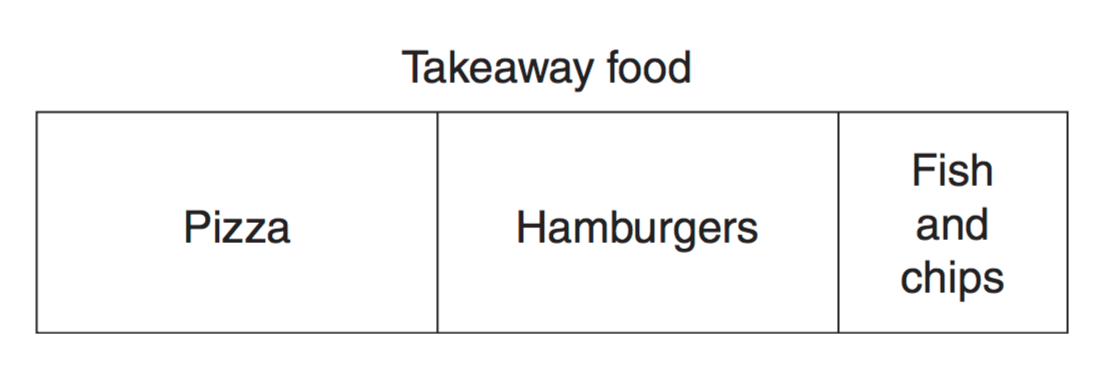
How many people chose pizza as their favourite takeaway food? (2 marks)
You are organising an outside sporting event at Mathsville and have to decide which month has the best weather for your event. The average temperature must be between 20°C and 30°C, and average rainfall must be less than 80 mm.
The radar chart for Mathsville shows the average temperature for each month, and the table gives the average rainfall for each month.

--- 1 WORK AREA LINES (style=lined) ---
--- 1 WORK AREA LINES (style=lined) ---
The step graph shows the cost of telephone calls to China.

Bella made a telephone call at 9.50 pm to a friend in China and spoke to him until 10.07 pm.
How much did this telephone call cost?
The area graph shows the cost and profits for a business over a period of time.

The information in the area graph is then displayed as a line graph.
Which of the following line graphs best displays the data from the area graph?


The step graph shows the charges for a carpark.

Maria enters the carpark at 10:10 am and exits at 1:30 pm.
How much will she pay in charges?
The Pi Company has two bakeries. The radar chart displays the monthly sales for the bakeries.

What was the difference in sales in June between the two bakeries?
The results of a survey are displayed in the dot plot.
What is the range of this data?
