The point `P` divides the interval from `Atext{(−4, −4)}` to `B(1,6)` internally in the ratio 2:3.
Find the `x`-coordinate of `P`. (1 mark)
Aussie Maths & Science Teachers: Save your time with SmarterEd
The point `P` divides the interval from `Atext{(−4, −4)}` to `B(1,6)` internally in the ratio 2:3.
Find the `x`-coordinate of `P`. (1 mark)
Two particles move along the `x`-axis.
When `t = 0`, particle `P_1` is at the origin and moving with velocity 3.
For `t >= 0`, particle `P_1` has acceleration given by `a_1 = 6t + e^(-t)`.
--- 4 WORK AREA LINES (style=lined) ---
When `t = 0`, particle `P_2` is also at the origin.
For `t >= 0`, particle `P_2` has velocity given by `v_2 = 6t + 1-e^(-t)`.
--- 5 WORK AREA LINES (style=lined) ---
--- 12 WORK AREA LINES (style=lined) ---
Carbon-14 is a radioactive substance that decays over time. The amount of carbon-14 present in a kangaroo bone is given by
`C(t) = Ae^(kt),`
where `A` and `k` are constants, and `t` is the number of years since the kangaroo died.
--- 2 WORK AREA LINES (style=lined) ---
Show that the value of `k`, correct to 2 significant figures, is – 0.00012. (2 marks)
--- 6 WORK AREA LINES (style=lined) ---
Find the number of years since the kangaroo died. Give your answer correct to 2 significant figures. (2 marks)
--- 6 WORK AREA LINES (style=lined) ---
A stone drops into a pond, creating a circular ripple. The radius of the ripple increases from 0 cm, at a constant rate of `5\ text(cm s)^(−1)`.
At what rate is the area enclosed within the ripple increasing when the radius is 15 cm?
A. `25pi\ text(cm)^2\ text(s)^(−1)`
B. `30pi\ text(cm)^2\ text(s)^(−1)`
C. `150pi\ text(cm)^2\ text(s)^(−1)`
D. `225pi\ text(cm)^2\ text(s)^(−1)`
| (i) | `int_0^(pi/3) cos x\ dx` | `= [sin x]_0^(pi/3)` |
| `= sin\ pi/3 – 0` | ||
| `= sqrt 3/2` |
| (ii) |  |
| `x` | `0` | `overset(pi) underset(6) _` | `overset(pi) underset(3) _` | |
| `y` | `1` | `overset(sqrt 3) underset(2) _` | `overset(1) underset(2) _` | |
| `y_0` | `y_1` | `y_2` |
| `int_0^(pi/3) cos x\ dx` | `~~ h/3 [y_0 + 4y_1 + y_2]` |
| `~~ pi/6 ⋅ 1/3 [1 + 4 ⋅ sqrt 3/2 + 1/2]` | |
| `~~ pi/18 ((4 sqrt 3 + 3)/2)` | |
| `~~ ((4 sqrt 3 + 3) pi)/36` |
(iii) `text{Using parts (i) and (ii)}`
| `((4 sqrt 3 + 3) pi)/36` | `~~ sqrt 3/2` |
| `:. pi` | `~~ (36 sqrt 3)/(2(3 + 4 sqrt 3))` |
| `~~ (18 sqrt 3)/(3 + 4 sqrt 3) … text( as required)` |
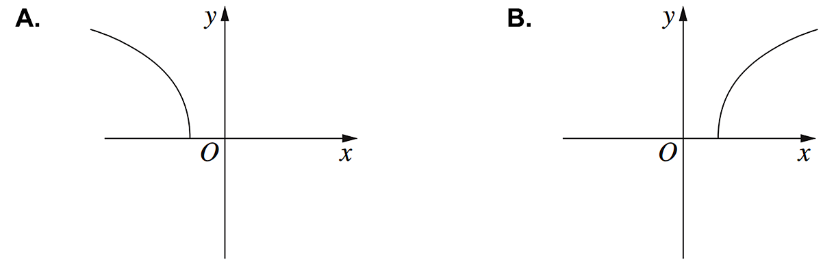
Which graph best represents the function `y = (2x^2)/(1 - x^2)`?
| A. |  |
B. |  |
| C. |  |
D. |  |
The points `A`, `B`, `C` and `D` lie on a circle and the tangents at `A` and `B` meet at `T`, as shown in the diagram.The angles `BDA` and `BCD` are 65° and 110° respectively.

What is the value of `angleTAD`?
A. `130°`
B. `135°`
C. `155°`
D. `175°`
It is given that `log_a8 = 1.893`, correct to 3 decimal places.
What is the value of `log_a4`, correct to 2 decimal places?
A. `0.95`
B. `1.26`
C. `1.53`
D. `2.84`
The rate at which water flows into a tank is given by
`(dV)/(dt) = (2t)/(1 + t^2)`,
where `V` is the volume of water in the tank in litres and `t` is the time in seconds.
Initially the tank is empty.
Find the exact amount of water in the tank after 10 seconds. (3 marks)
--- 6 WORK AREA LINES (style=lined) ---
Consider the curve `y = 2x^3 + 3x^2 - 12x + 7`.
--- 8 WORK AREA LINES (style=lined) ---
--- 8 WORK AREA LINES (style=lined) ---
--- 1 WORK AREA LINES (style=lined) ---
`text(minimum at)\ (1, 0)`

| i. | `y` | `= 2x^3 + 3x^2 – 12x + 7` |
| `(dy)/(dx)` | `= 6x^2 + 6x – 12` | |
| `(d^2y)/(dx^2)` | `= 12x + 6` |
| `text(S.P. when)\ (dy)/(dx)` | `= 0` |
| `6x^2 + 6x – 12` | `= 0` |
| `x^2 + x – 2` | `= 0` |
| `(x + 2) (x – 1)` | `= 0` |
`x = -2 or 1`
`text(When)\ \ x = –2, (d^2y)/(dx^2) < 0`
`:.\ text(MAX at)\ (–2, 27)`
`text(When)\ \ x = 1, (d^2y)/(dx^2) > 0`
`:.\ text(MIN at)\ (1, 0)`
| ii. | |
iii. `text(Solution 1)`
`text(From graph, gradient is positive for)`
`x < –2 and x > 1`
`:. (dy)/(dx) > 0\ \ text(for)\ \ x < –2 and x > 1`
`text(Solution 2)`
`(dy)/(dx) > 0`
| `6x^2 + 6x – 12` | `> 0` |
| `(x + 2) (x – 1)` | `> 0` |

`:. x < –2 and x > 1`
A spinner is marked with the numbers 1, 2, 3, 4 and 5. When it is spun, each of the five numbers is equally likely to occur.

The spinner is spun three times.
The points `A(–4, 0)` and `B(1, 5)` lie on the line `y = x + 4`.
The length of `AB` is `5 sqrt 2`.
The points `C(0, –2)` and `D(3, 1)` lie on the line `x - y - 2 = 0`.
The points `A, B, D, C` form a trapezium as shown.

The diagram shows the region bounded by `y = sqrt (16 - 4x^2)` and the `x`-axis.

The region is rotated about the `x`-axis to form a solid.
Find the exact volume of the solid formed. (3 marks)
Find the equation of the tangent to the curve `y = x^2 + 4x - 7` at the point `(1, -2)`. (2 marks)
--- 4 WORK AREA LINES (style=lined) ---
Solve `|3x-1| = 2`. (2 marks)
In the diagram, `OAB` is a sector of the circle with centre `O` and radius 6 cm, where `/_ AOB = 30^@`.

--- 3 WORK AREA LINES (style=lined) ---
--- 3 WORK AREA LINES (style=lined) ---
Differentiate `x^3 ln x`. (2 marks)
Differentiate `(sin x)/x`. (2 marks)
--- 5 WORK AREA LINES (style=lined) ---
Find `int (2x + 1)^4\ dx`. (1 mark)
Rationalise the denominator of `2/(sqrt(5)-1)`. (2 marks)
What is the derivative of `e^(x^2)`?
Which expression is equal to `3x^2-x-2`?
What is the gradient of the line `2x + 3y + 4 = 0`?
All the students in a class of 30 did a test.
The marks, out of 10, are shown in the dot plot.

--- 1 WORK AREA LINES (style=lined) ---
Using the dot plot, calculate the percentage of the marks which lie within one standard deviation of the mean. (2 marks)
--- 4 WORK AREA LINES (style=lined) ---
--- 2 WORK AREA LINES (style=lined) ---
Temperature can be measured in degrees Celsius (`C`) or degrees Fahrenheit (`F`).
The two temperature scales are related by the equation `F = (9C)/5 + 32`.
`qquadF = C`

Jamal surveyed eight households in his street. He asked them how many kilolitres (kL) of water they used in the last year. Here are the results.
`220, 105, 101, 450, 37, 338, 151, 205`
--- 1 WORK AREA LINES (style=lined) ---
--- 1 WORK AREA LINES (style=lined) ---
Kate is comparing two different models of car. Car A uses fuel at the rate of 9 L/100 km. Car B uses 3.5 L/100 km.
Suppose Kate plans on driving 8000 km in the next year.
How much less fuel will she use driving car B instead of car A?
The heights of Year 12 girls are normally distributed with a mean of 165 cm and a standard deviation of 5.5 cm.
What is the `z`-score for a height of 154 cm?
A. `−2`
B. `−0.5`
C. `0.5`
D. `2`
Which of the data sets graphed below has the largest positive correlation coefficient value?
| A. |  |
B. |  |
| C. |  |
D. |  |
What is the value of `x` in the equation `(5-x)/3 = 6`?
Tom earns a weekly wage of $1025. He also receives an additional allowance of $87.50 per day when handling toxic substances.
What is Tom’s income in a fortnight in which he handles toxic substances on 5 separate days?
In a survey of 200 randomly selected Year 12 students it was found that 180 use social media.
Based on this survey, approximately how many of 75 000 Year 12 students would be expected to use social media?
A. 60 000
B. 67 500
C. 74 980
D. 75 000
The graph shows the relationship between infant mortality rate (deaths per 1000 live births) and life expectancy at birth (in years) for different countries.

What is the life expectancy at birth in a country which has an infant mortality rate of 60?
\(\text{When infant mortality rate is 60, life expectancy}\)
\(\text{at birth is 68 years (see below).}\)

\(\Rightarrow A\)
A car is travelling at 95 km/h.
How far will it travel in 2 hours and 30 minutes?
Which one of these gives an answer of 87?
| 8 + 7 | 80 + 17 | 70 + 17 | 70 + 7 |
|
|
|
|
|
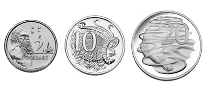
Which set of coins shows the same amount of money as the coins above?
|
|
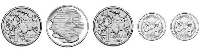 |
|
|
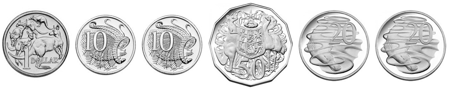 |
|
|
 |
|
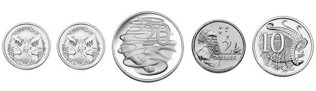
|
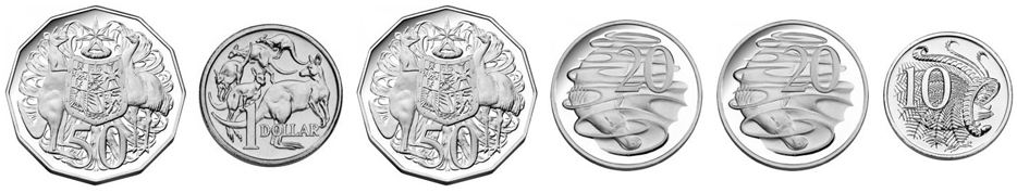 |
`text(Amount that equals $2.30 is:)`
Sachin owned these cricket bats.
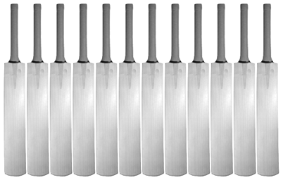
He gave half of them away.
How many cricket bats does Sachin keep?
| 5 | 6 | 10 | 12 |
|
|
|
|
|
--- 12 WORK AREA LINES (style=lined) ---
--- 2 WORK AREA LINES (style=lined) ---
Solve the equation `log_e(3x + 5) + log_e(2) = 2`, for `x`. (2 marks)
In this diagram of the Earth, `O` represents the centre and `B` lies on both the Equator and the Greenwich Meridan.

What is the latitude and longitude of point `A`?
A. `text(30°N 110°E)`
B. `text(70°N 30°W)`
C. `text(110°N 60°E)`
D. `text(30°N 110°W)`
E. `text(60°N 110°W)`
Let `y = (cos(x))/(x^2 + 2)`.
Find `(dy)/(dx)`. (2 marks)
--- 4 WORK AREA LINES (style=lined) ---
The discrete random variable `X` has probability distribution as given in the table. The mean of `X` is 5.

The values of `a` and `b` are
The solution set of the equation `e^(4x) - 5e^(2x) + 4 = 0` over `R` is
A. `{1, 4}`
B. `{– 4, – 1})`
C. `{– 2, – 1, 1, 2})`
D. `{– log_e(2), 0, log_e(2)}`
E. `{0, log_e(2)}`
The random variable `X` has a normal distribution with mean 11 and standard deviation 0.25.
If the random variable `Z` has the standard normal distribution, then the probability that `X` is less than 10.5 is equal to
If `y = log_a (7x - b) + 3`, then `x` is equal to
Let `g(x) = x^2 + 2x - 3 and f(x) = e^(2x + 3).`
Then `f(g(x))` is given by
For the polynomial `P(x) = x^3 − ax + 4,\ \ P( – 3) = – 5.`
The value of `a` is
A. `− 12`
B. `− 5`
C. `– 3`
D. `3`
E. `6`
If `x-2` is a factor of `2x^3 - 10x^2 + 6x + a` where `a in R text{\}{0},` then the value of `a` is
A. `-68`
B. `-20`
C. `-2`
D. `2`
E. `12`
The graph of the function `f(x) = e^(2x) - 2` intersects the graph of `g(x) = e^x` where
The graph of the function `f: D -> R,\ f(x) = (x - 3)/(2 - x),` where `D` is the maximal domain has asymptotes
The inverse of the function `f: R^+ -> R,\ f(x) = 1/sqrt x - 3` is
The diagram shows the graph `y = f(x)`.

Which diagram shows the graph `y = f^(-1) (x)`?


`f^(-1) (x)\ text(is the reflection of)\ f(x)`
`text(in the line)\ y = x`
`=> D`
The graph shown is `y = A sin bx`.

--- 1 WORK AREA LINES (style=lined) ---
--- 6 WORK AREA LINES (style=lined) ---
On the same set of axes, draw the graph `y = 3 sin x + 1` for `0 <= x <= pi`. (2 marks)
--- 10 WORK AREA LINES (style=blank) ---
a. `A = 4`
b. `text(S)text(ince the graph passes through)\ \ (pi/4, 4)`
`text(Substituting into)\ \ y = 4 sin bx`
| `4 sin (b xx pi/4)` | `=4` |
| `sin (b xx pi/4)` | `= 1` |
| `b xx pi/4` | `= pi/2` |
| `:. b` | `= 2` |
| c. |  |
Let `f(x)=(1 + tan x)^10.` Find `f^{\prime}(x)`. (2 marks)
--- 4 WORK AREA LINES (style=lined) ---
Find an anti-derivative of `(1 + cos 3x)` with respect to `x`. (2 marks)
--- 2 WORK AREA LINES (style=lined) ---
Differentiate with respect to `x`:
Let `f(x)=x tan x`. Find `f^{prime}(x)`. (2 marks)
--- 4 WORK AREA LINES (style=lined) ---
The rule for `f` is `f(x) = x-1/2 x^2` for `x <= 1`. This function has an inverse, `f^(-1) (x)`.
--- 6 WORK AREA LINES (style=lined) ---
--- 8 WORK AREA LINES (style=lined) ---
--- 5 WORK AREA LINES (style=lined) ---

| a. |
|
| b. | `y = x-1/2 x^2,\ \ \ x <= 1` |
`text(For the inverse function, swap)\ \ x↔y,`
| `x` | `= y-1/2 y^2,\ \ \ y <= 1` |
| `2x` | `= 2y-y^2` |
| `y^2-2y + 2x` | `= 0` |
`text(Using quadratic formula,)`
| `y` | `= (2 +- sqrt( (-2)^2-4 * 1 * 2x) )/2` |
| `= (2 +- sqrt(4-8x))/2` | |
| `= (2 +- 2 sqrt(1-2x))/2` | |
| `= 1 +- sqrt (1-2x)` |
`:. y = 1-sqrt(1-2x), \ \ (y <= 1)`
| c. | `f^(-1) (3/8)` | `= 1-sqrt(1-2(3/8))` |
| `= 1-sqrt(1-6/8)` | ||
| `= 1-sqrt(1/4)` | ||
| `= 1-1/2` | ||
| `= 1/2` |
Find the value of `int (6x^2)/(x^3 + 1)\ dx`. (2 marks)
--- 3 WORK AREA LINES (style=lined) ---
Find an antiderivative of `int 1 + e^(7x)` with respect to `x`. (1 mark)
--- 2 WORK AREA LINES (style=lined) ---
--- 3 WORK AREA LINES (style=lined) ---
--- 6 WORK AREA LINES (style=lined) ---